Juventus, or Juve, is an icon of European football. One of the most popular clubs ever, it was formed in 1897 in Italy. The professional team is on the top of the list of the most rewarded Italian clubs and has a huge fan-base, probably the largest in the world. The club is owned by the Agnelli family and has Mauricio Sarri as the head coach.
Meaning and history
Apart from its stylish vertically striped monochrome badge, Juventus’ visual identity is also known for a classy crest, switching between two animalistic symbols — a horse and a bull.
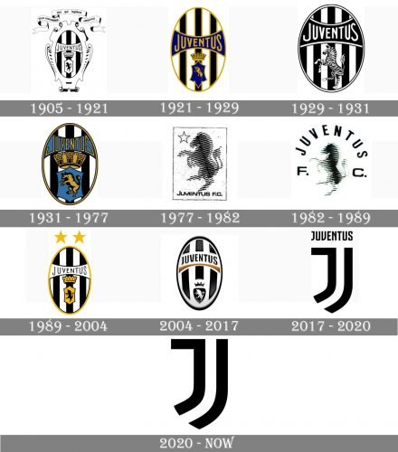
The logo of one of the strongest and most famous European football clubs has undergone six major redesigns, and all seven emblems, created for it throughout the years make up a graphical representation of Juventus evolution and progress.
What is Juventus?
Juventus is the name of one of the most famous and titled Italian football clubs, which was established in 1897. The club is based in Turin and has Juventus Stadium as its home arena, and Massimiliano Allegri as the head coach.
1905 — 1921
The very first logo for Juventus for introduced in 1905 and comprised an elegant oval with a vertical black and white pattern, enclosed in a wide vignette frame and with an ornate curved ribbon above it. Two elements on the crest were the black wordmark on a white horizontally stretched banner and a small shield with a heraldic black bull on it. There was also a strict and solid white crown, placed between the bull-crest and the nameplate. The lettering on the ribbon was in Latin “Non coronabitur nisi qui legitime certaverit” which can be translated into English as “He does not receive the crown, he who does not play by the rules”.
1921 — 1929
The redesign of 1921 removed all the ornate elements from the club’s visual identity, keeping only the tripes oval with three symbols. The monochrome color palette got diluted by gold and blue, with each stripe outline in gold and the banner of the nameplate and the bull-crest in blue.
1929 — 1931
The funniest and the most playful version of the Juventus logo was created in 1929 but only stayed with the team for two years. The color palette of the badge turned monochrome again, and instead of the small crest with the golden bull and a crown, there was a large zebra drawn standing on two legs.
1931 — 1977
The color palette was refined again in 1931, but this was not the only change in the Juventus visual identity. The lettering on a blue banner gained a new custom sans-serif typeface where the first and last letters of the wordmark had their tails elongated and geometrically curved. The crown above the small blue secrets was enlarged and became really massive.
1977 — 1982
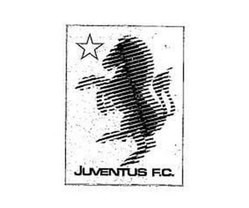
With the redesign of 1977, the Italian football club gets a new mascot — a horse. And the logo, created in the 1970s featured a white rectangle with an outlines five-pointed star on the upper left corner, a sans-serif black inscription on the bottom parts, and a large blurred silhouette of a standing horse in gradient black and gray.
1982 — 1989
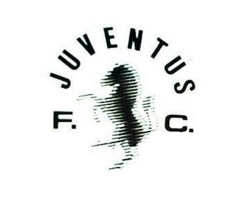
The rectangular frame and the Star were removed from the Juventus visual identity in 1982. The main wordmark was now set in all capitals of a neat and traditional sans-serif typeface and arched above the blurred horse, while the “F. C.” Letters were placed from the left and right of the emblem.
1989 — 2004
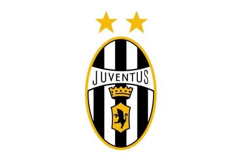
In 1989 the team starts using the badge from the 1920s again, but the contours and colors are being modified and cleaned. Now the oval is enclosed into a thin gold frame, and the logotype is written in a delicate lightweight sans-serif on a white background.
2004 — 2017
In 2004 the club introduced its first three-dimensional logo, where all the elements are redrawn in a modern and stylish way with a lot of air. Now the only colored element of the visual identity is a smooth gold arch, separating the church narrowed inscription from the small triangular crest with a white bull and a black crown.
2017 — 2020
The new approach was implemented by the club in 2017. The iconic oval with vertical stripes and the heraldic bull, which stayed with Juventus for more than a century, was gone. The logo from the 2010s features a stylized letter “J” in thick black lines with another symbol, repeating its contours on the right. Two lines with the name of the club written on top in a narrowed sans-serif typeface, form a shape of a traditional crest.
2020 — Today
In 2020 the logo of Juventus has been refined again, by making it even more minimalist and short. The wordmark was removed, and now it’s all about the clean thick lines and a powerful black and white combination.
Emblem
The departure from the traditional oval shape has triggered some fuss among the Juventus fan community. However, it is simplicity and memorability that makes a good logo, and it is a logo that touts a good thing. In this respect, the new Juventus logo seems to be outdoing all its predecessors.
Font and color
The Juventus visual identity is based on bold clean lines, making up a stylized crest with the custom capital letter “J” in a fancy and modern sans-serif typeface. There are no commercial fonts to be compared to this designer type.
As for the color palette of the Juventus visual identity, it is composed of black-and-white, as well as the iconic team’s uniform, which makes the players of the club perfectly visible on a green football field. The black and white logo of Juventus is something extremely stylish and timeless.
Juventus Colors
BLACK
PANTONE: BLACK C
HEX COLOR: #000000;
RGB: (0,0,0)
CMYK: (0,0,0,100)
WHITE
HEX COLOR: #FFFFFF;
RGB: (255,255,255)
CMYK: (0,0,0,0)


