Jonas Brothers are the name of an American pop-rock band, which was established in 2005 by three brothers — Nick, Joe, and Kevin. The band became popular after its appearance on Disney Channel and sold about 20 million albums worldwide.
Meaning and history
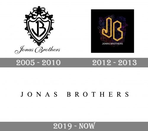
Jonas Brothers were extremely popular among teenagers in the middle of the 2010s, but then, in 2013 they decided to finish their careers. Since the date of the band’s establishment, there has been only one major logo redesign, which completely changed the visual identity perception of the style of the famous Brothers.
The band’s loud come back of 2019 made all the fans happy and brought a new image of the Jonas Brothers, showing them more mature and professional.
2005 — 2010
The initial logo of the pop-rock music band was composed of a traditional ornate shield with a monogram on it. The wordmark “Jonas Brothers” in cursive with elongated curved lines was placed under the shield.
The two letters of the monogram, “J” and “B”, we’re sharing their vertical bar, which made the image balanced and stylish. The symbol became instantly recognizable across the globe and stayed with the band for pretty long.
2012 — 2013
A completely different image became the band’s logo in 2012. It was a strong and contemporary emblem, which had nothing in common with the previous one, except for its composition — the monogram in the center and the wordmark under it.
The new logo was placed on a gradient purple and black background with an abstract geometric pattern. Two bold letters, “J” and “B”, we’re perfectly inscribed in the geometry of the picture, and their bold futuristic contours featured a calm yet bright yellow shade.
The “Jonas Brothers” nameplate executed in a simple and clean sans-serif typeface was drawn in small capitals in white color, making the logo look professional and fundamental.
This was the last logo of the first successful period of the Jonas Brothers band, which all their fans kept in their hearts until the musicians’ comeback six years later.
2019 — Today
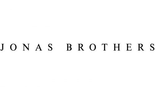
The group returned to the big stage in 2019 with their new album and new style. The visual identity design of the Jonas Brothers went minimalist and simple, which is the main trend of the last years.
Now the band’s logo is composed of a single wordmark, where all capital letters are executed in a traditional clean serif font with lots of space between the symbols and the two parts of the inscription.
Executed in black, the logotype looks good on any background and evokes a sense of strength, stability, and expertise.


