Iso was a notable Italian company primarily engaged in producing high-end cars and motorcycles. Founded by Renzo Rivolta, it gained fame for models like the Iso Rivolta and Iso Grifo. The company operated mainly in Italy but spread its wings to other European markets. By the early 1970s, facing financial challenges, its automobile production ceased.
Meaning and history
Established by Renzo Rivolta in 1953, Iso was an Italian automaker recognized for crafting luxury cars and motorcycles. In its prime, the company launched iconic models like the Iso Grifo, which became synonymous with Italian elegance and performance. Operating predominantly in Italy, Iso expanded its reach across Europe. However, by 1974, due to financial difficulties, the company ceased its automobile production, marking the end of an era in the Italian automotive industry.
What is Iso?
Iso was an Italian automaker active from 1953 to 1974, renowned for producing luxury cars and motorcycles.
1953 – 1955
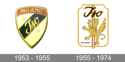
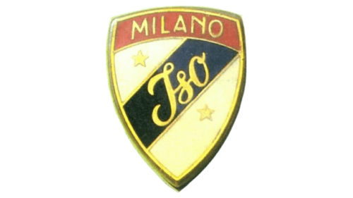
A shield shape has been frequently used by automobile brands for their logos. This automaker decided to go for a triangular shape with rounded sides. It featured a three-dimensional golden border that added a rich touch. The golden color was also used for the inscriptions and two stars. The latter were placed on either side of a black stripe that ran diagonally across the shield from the lower left side to the upper right corner. It carried the name printed using a cursive font with the first letter being capitalized. A red line across the top completed the picture. It was used to specify the location of the brand and said “Milano” in all uppercase, sans-serif letters.
1955 – 1974
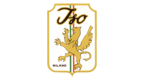
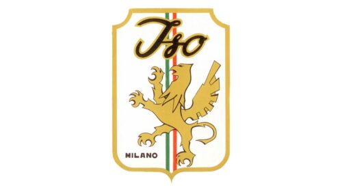
The updated logo has a lot more character and details. Besides giving the shield a more rectangular shape, the company introduced a new character – a golden griffin standing on its back feet. Above this mythical and impressive creature, the logo carried the name. It was printed using a very similar cursive font as in the original logo, only in a straight line. The black and golden color of the inscription further enhanced an association with the original emblem. The company also honored its country by adding a striped vertical line in the background that featured the national colors of Italy. “Milano” was now printed using a relatively small font in the lower left corner. The new emblem turned out quite sophisticated and strong.


