Internet Explorer is a web-browser, created by Microsoft in 1995. At the beginning of the 2000s, it was the most popular browser, but later a lot of competitors appeared on the market. Internet Explorer is available in more than 90 languages but not supported by Android and Mac operating systems.
Meaning and history
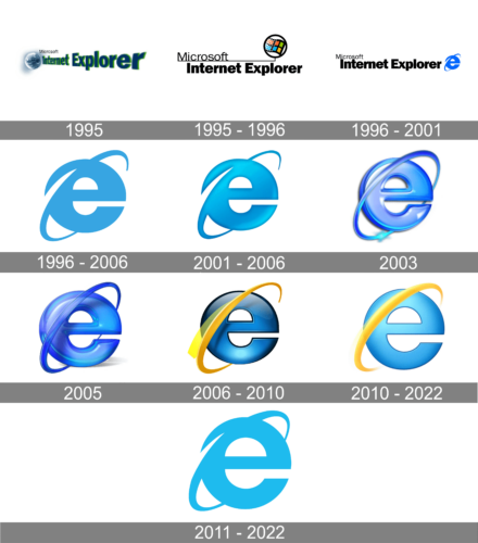
The iconic Internet Explorer icon first appeared as a part of the browser’s logo, created in 1996. Today it is one of the most recognizable emblems across the globe, but before its creation, there were two visual identity versions, that not many people remember of.
1995

The very first Internet Explorer logo was designed in 1995 and depicted an image of the Earth with a “Microsoft Internet Explorer” wordmark.
The Earth was drawn in a calm blue white and gray color palette, while the “Internet Explorer” lettering featured dark blue with a green shadow. The word “Microsoft”, thin and black, was placed on the right of the globe.
1995 – 1996

The next version of the logo was designed later in the same year and was based on the Microsoft visual identity. The logo was composed of a wordmark, set in two levels, and an emblem on its right.
The upper level of the nameplate was “Microsoft” in its signature elegant typeface, while the lower level depicted “Internet Explorer” in extra-bold sans-serif. The emblem features a Microsoft iconic four-colored flag, enclosed in a circle.
1996 – 2001
1996 is the year when the iconic emblem appears on the Internet Explorer logo. It is placed on the right of the wordmark and features a bold bright blue letter “E” in the lowercase with the orbit, crossing it diagonally and representing “I” (for the “Internet”).
1996 – 2006

In 1996 the IE icon becomes an official logo. The color is changed to a lighter shade of blue, and the contour of the emblem is slightly refined.
2001 – 2006

In 2001 the emblem becomes more three-dimensional, gaining a deeper gradient blue color. It looks bright and vivid, evoking a friendly and welcoming feeling. The new icon stays with the browser for five years.
2003
For the last few years, the company has already tested a look with the addition of shadows to create volume. This time, they made the logo look almost three-dimensional and made the emblem glossy and with a purple tint. It reflected the style of the early 2000s.
2005

The redesign of 2004 has introduced a cool and bright three-dimensional Internet Explorer logo, which has only stayed active for a few months. It was a glossy purple lowercase “E”, which fully repeated the contours of the previous badge, but had its orbit closed and drawn in a solid line. As for the letter, it had an interesting “glass” surface, which also resembled a Candy. The bottom part of the letter was drawn with some light blue gradients, repeating the shade of two previous emblems.
2006 – 2010

The logo was once again redesigned in 2006, after the rebranding of Microsoft IE as Windows Internet Explorer. The letter “E” became darker and gained a black outline, while the orbit changed its color to yellow.
2010 – 2022
Another version of the logo, which is still in use nowadays was designed in 2012. It is a light blue flat icon, which looks like the one from 1997, but in a refined shape and a brighter shade of blue. No yellow color here.
2011 – 2022
In 2011the color combination was the same, but both colors became lighter and the orbit was modified. The “E” also changes its typeface, and now looks fresher and more crispy. The logo from 2011 is still in use today on Windows 7/10 and 8x.
Icon
The icon of Internet Explorer hasn’t changed much throughout the years, as well as the main logo of the browser. By today the lines and contours of the famous light blue lowercase “E” have become more distinct and clean, and the main color — brighter. As for the Swoosh, crossing the letter diagonally, it has become thinner and its vivid yellow color started looking more eye-catching, evoking a sense of energy and movement.
The white background of the icon softens and smoothens the whole composition, making the image evoke a sense of responsibility and professionalism.


