In-N-Out Burger is not just a simple fast-food restaurant chain from California, but the state’s calling card. Throughout its existence, since 1948, not a single restaurant has been opened under a franchise, which says a lot about the values of the brand and its loyalty to its roots. The company also refused an IPO, so the In-N-Out Burger chain is still privately owned.
Meaning and history
In-N-Out Burger company was founded by Harry and Esther Snyder in 1948. The couple has a pretty simple idea: to offer the customers some inexpensive hamburger-based menus, in which all the ingredients are prepared by hand, from the best and freshest products.
In the same year 1948, Harry Snyder introduced technology to serve the driver through a loudspeaker, so that customers could remain in the cabin of the car, making an order. The innovation was destined to change the system of fast food all over the world, although other diner chains introduced the technology much later: the Jack in the Box chain introduced it in 1951, and the first McDonald’s restaurant with similar devices appeared only in 1975.
Another trend, set by the chain, was a special diet menu. In 1955, long before the fashion for low-carb diets, In-N-Out began selling burgers without a bun, where all the ingredients were wrapped in lettuce leaves.
What is In-N-Out Burger?
In-N-Out Burger is the name of an American fast-food restaurant chain, which was established in 1948, and today has almost 400 locations across the southwest states of the country. The chain is specialized in burgers and is owned by the Snyder Family.
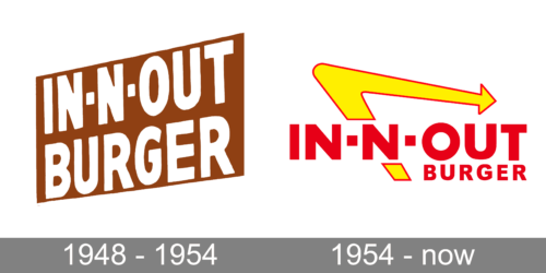
In terms of visual identity, the company has also stayed loyal to its heritage, with the o to redesign of the badge held in 1954. Since then the logo of the In-N-Out Burger chain hasn’t been changed at all, and this made the badge instantly recognizable and iconic.
1948 – 1954
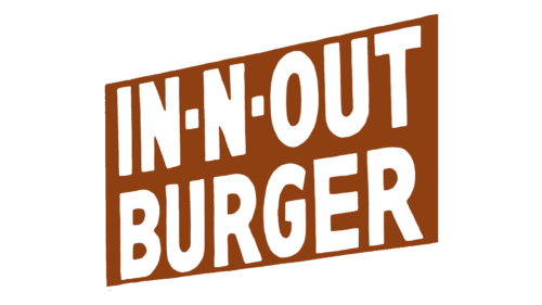
The original In-N-Out Burger logo was created in 1948 and stayed active for the first six years of the company’s existence. It was a simple two-leveled inscription in white capital letters of a modern geometric sans-serif font, set against a dark red rectangular banner. There were no graphical additions, just clean distinctive shapes, evoking a sense of professionalism and reliability.
1954 – Today
The redesign of 1954 created a brighter and more ornate version of the logo, which is still used by the company today. The badge is composed of red sans-serif lettering with heavy stable contours of the letters, accompanied by a stylized yellow arrow in a thin red outline. All elements are placed on a plain white background.
Font and color
The heavy geometric lettering from the primary logo of the In-N-Out Burger chain is set in a clean modern sans-serif font, which is pretty close to such typefaces as F.O.T.R. Black, Conneqt Black, or Hebden Grotesque.
As for the color palette of the In-N-Out Burger visual identity, it is based on a bright and vivid combination of red and yellow, which evokes a sense of energy and dynamic, and shows the company as a stately developing and growing one. Red is also a color of passion and love, and the chain does love its customers and cares about them.


