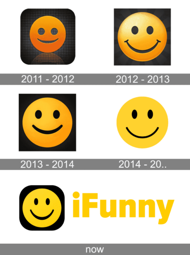
In spite of the many updates the iFunny logo has gone through over its comparatively short history, it has preserved its core virtually unchanged. The stylized smiley face is still looking at us, like a decade ago.
Meaning and history

iFunny was created for people, who like a good laugh. The website contains a huge amount of humorous graphics, GIFs, and animations, and is also known as one of the first destinations to go for memes. The visitors of the website are those who create the content and update it. Created by FunCorp in 2011, iFunny also has a mobile application that is available not only in Russianbut also in English and Portuguese.
As for the visual identity of the humor online platform, it has always been based on a smiling emoji, executed in different shades of orange to yellow.
What is iFunny?
iFunny is the name of a website, which is specializedin humor and memes. The portal is also known for its pretty large collection of animated GIFs. iFunny was established in Russia in 2011 but has its versions available in English and Portuguese too. The platform also has an application for both Android and iOS.
2011 – 2012
The first version of the app that appeared on the App Store in the spring of 2011 showcased a smiley face in rather dark shades of yellow bordering on orange. It has been the darkest of all the versions released so far (if it is appropriate to use the word “dark” for yellow altogether). The smiley face was placed over the black and gray background with multiple cells (it looks like a grid). Also, there is a shade below as if the surface were glittery.
We can’t help but point out that there’s something sinister about this version, though. This feel might result from the fact that the eyes are pretty large and represent perfect circles, while in real life a sincere smile makes us squint slightly.
2012 – 2013
The sinister feel has disappeared altogether. The smile has grown wider, with a more pronounced curve and additional tiny curves from both ends. The eyes are smaller and elliptical (which still doesn’t reflect the real-life facial expression but for some reason looks friendlier than the original circles).
The palette is more optimistic due to the lighter shades of yellow. The gradient is more pronounced, as is the 3D effect.
In addition to the primary version of the iFunny logo, there was also an icon, where the smiley face had a shade, which added even more dimension.
2013 – 2014
This one appears more minimalist. The range of colors is by far smaller, which results in a flatter look. This is not to say that the design has grown worse in any way – quite the opposite. Due to the disappearance of the curves and the fact that the stroke forming the smile is more homogeneous in its thickness, the icon is now easier to grasp. The update is totally in line with current art trends emphasizing the need for minimalist designs.
2014 – ….

The accent has moved from the eyes to the smile. How have the designers achieved this effect? First, they made the eyes smaller and moved them closer to each other. As all of us know, when we smile sincerely or laugh, our eyes become smaller.
Also, the authors of the logo made the smile broader. We should point out, though, that the curve of the smile isn’t so thick now. This version appears even flatter than its already quite flat predecessor.
Today
The current iFunny logo still uses a yellow smiling emoji as the main element, but has it placed on a black square with rounded angles, on the left from the heavy bold title case lettering in a traditional sans-serif font. The yellow in the emblem is supported by the same shade in the inscription, but the wordmark is set against a white background, hence looks lighter and brighter.
Colors and font
The reasons for choosing this very color scheme are quite transparent. Yellow is the default color of the smiley face, while the black background is used over the whole of the website. The reason for this is probably the fact that many of the website viewers visit it when they are in a dark room, so a lighter background would have made one’s eyes sore.
The type used in the iFunny logo is a utilitarian and rather generic sans providing maximum legibility.
What is iFunny
The humor website and app offers user-submitted media ranging from images to videos to animated GIFs. Some of the most popular memes include ironic Doge memes and GIF Captions.


