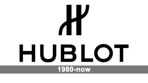
Due to the minimalistic color scheme, which includes only black and white, the unique shape of the Hublo logo seems even more prominent.
Meaning and history
The watches brands Hublot traces its roots to 1976, when Italian entrepreneur Carlo Crocco left Binda Group to set up a watch company of his own. The brand was officially established in 1980. The name of the brand comes from the French word meaning “porthole.”
Emblem
The main part of the Hublot watches logo is a stylized letter “H.” It’s formed by two vertical lines placed parallel to each other. Across the straight lines, a curvy line goes, which plays the same part as the horizontal bar of a regular “H.” However, in contrast to a regular “H,” the left and right ends of the curvy line stretch far beyond the vertical lines. Due to this, the emblem becomes very unusual and highly memorable.
Font
The simple sans serif type is based on square and rectangular shapes. The glyphs themselves are rather traditional in terms of curves and angles. Such fonts as Gotham Medium and Nexa Bold may look somewhat similar.
Colors
The simple elegance of the combination of black and white has inspired a lot of logo designers. Monochrome logotypes are hugely popular in the world of beauty and fashion. In the case of the Hublot logo, the color scheme helps to draw attention to the outstanding shape of the emblem.


