

![]() Hollister Logo PNG
Hollister Logo PNG
The US fashion company Hollister Co. belongs to Abercrombie & Fitch Co. It aims at consumers aged 14–18.
Meaning and history
![]()
The first shop appeared in summer 2000 in Columbus, Ohio. The company has been using the seagull logo almost from the start. It has remained practically unchanged since its creation at the beginning of this century.
![]()
Why was the symbol removed from the clothes?
Several years ago many teenagers preferred to wear apparel with visible logos. So Hollister could safely put its emblem on hoodies and tees and expect high profits. However, with the end of the logo era the company discovered that its popularity is going down. In 2014 Abercrombie & Fitch, which is the owner of Hollister, reported a 9% drop in sales. Taking this into consideration, it’s hardly a surprise that the company’s management decided to cut the amount of apparel with visible logos.
Emblem

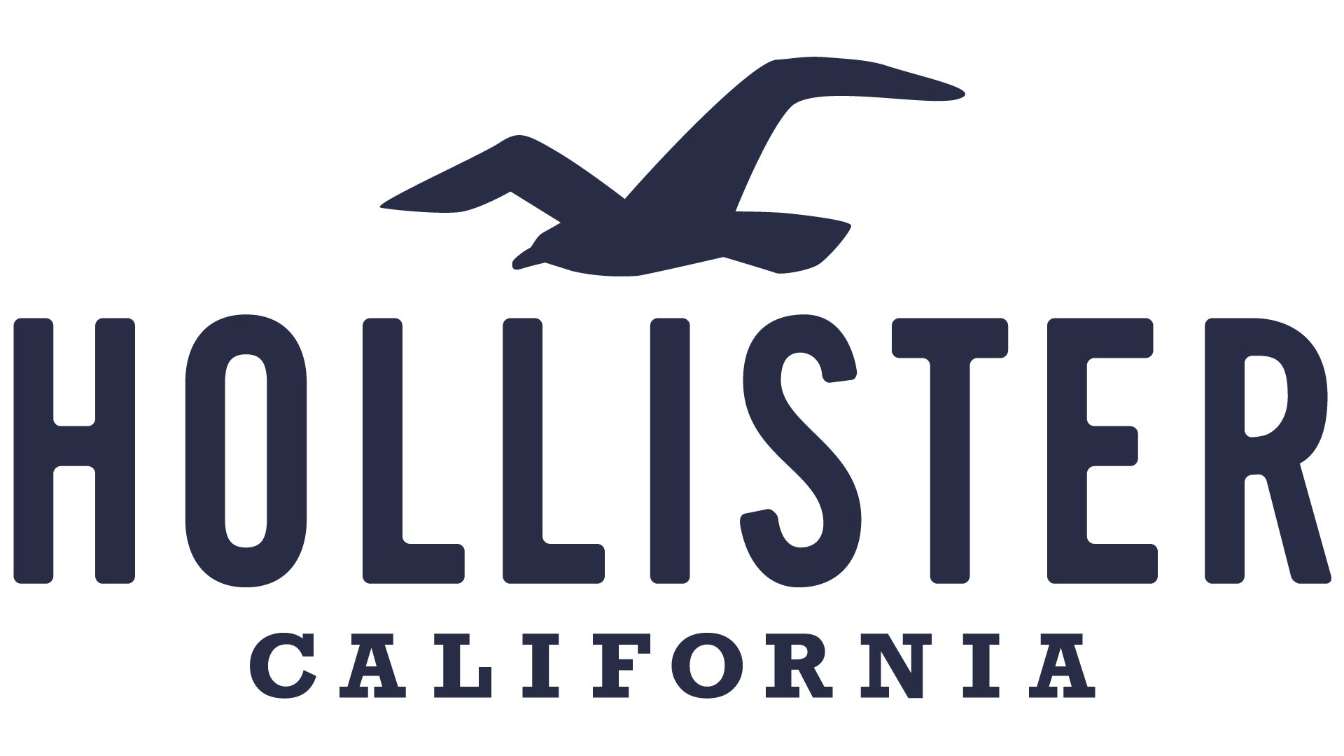
Probably the most recognizable part of the Hollister emblem is the picture of a seagull with spread wings. This symbol immediately conjures up the image of peaceful seashore, with soft sand and warm waves. One more reason why the image of a seagull can be especially appealing to the young is because it symbolizes freedom and unlimited horizon, as well as the surfing culture.
Colors
![]()
Generally speaking, the Hollister logo may appear in a wide range of colors, if placed on the clothes. However, in the print advertisements the company typically opts for the maroon color. The dark brownish red tint looks rather refined. According to psychological research, it symbolizes bravery and happiness.
Font

The typeface is absolutely simple. The two words present in the emblem feature different fonts. The “Hollister” inscription is made in a minimalistic sans-serif typeface, while the “California” word is written in a serif font. The characters in the latter word are smaller, both the words are capitalized.
![]()


