Hino is a Japanese brand of commercial-trucks and bus manufacturing companies, which was founded in 1910. The company is famous not only for producing vehicles but as well for its diesel-engines.
Meaning and history
 Hino is a company with a strong and good reputation and its visual identity is based on the principles of quality and stability.
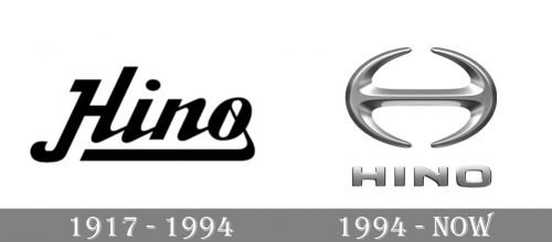
1917 – 1994

The very first badge of the Japanese truck manufacturer featured a fancy and bold script inscription in black. The smooth lines of the letters were thick and had rounded corners and curved tails, which resembled Japanese hieroglyphs. The whole wordmark was underlined by the element, coming out of the last letter “O”.
1994 – Today
The Hino logo is composed of a wordmark and an emblem on its top. It is three-dimensional and uses a silver-gray color in different shades, from light to dark and almost black on the ranges of the emblem.
The Hino wordmark is written in all capital letters and features a custom modern typeface with smooth bold lines and no serifs. The wordmark is executed in a matte silver color, putting the main accent on a glossy emblem.
The Hino emblem is a stylized letter “H” with arched vertical bars. It forms an open oval shape with a horizontal bar in the middle. The emblem reminds of a shuriken, which is a celebration of Asian culture and heritage.
Unlike the wordmark, the Hino emblem is executed in a glossy gradient silver. It looks sleek and powerful at its glance. The sharp insignia is a reflection of a powerful and reliable brand, which is innovative and progressive.
What is Hino?
Hino is the name of the Japanese automaker, which is owned by the famous Toyota and specialized in the production of trucks and other large commercial vehicles. The company also had a great reputation as the producer of engines, which run on diesel.


