HCL Technologies is an Indian IT service and consulting company. It started in 1976, when eight entrepreneurs left their secure corporate jobs and started working in a garage on a project that was based on an innovative approach to microprocessors. Today, the company has offices in 50 countries and employs over 167,550 people.
Meaning and history
The company has been exceptionally loyal to its visual brand identity. The HCL logo hardly changed over the first 45 years of its history. That’s, at least partly, because it possesses a timeless quality. Such minimalist, clean lines don’t age that much, even though we have to acknowledge that the heyday of Helvetica-inspired fonts seems to have passed several decades ago.
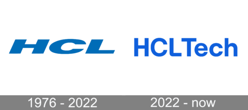
1976 – 2022
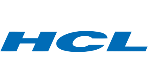
The original badge of the company featured a large italicized “HCL” inscription in an extended extra-bold sans-serif font, set in a smooth shade of blue, and looking very progressive and strong due to the significant inclination of the characters to the right, and the straight cuts of the bars.
1976 – Today

The logo showcases the name of the brand in blue set in a simple sans serif typeface. The type is italicized, which gives some dynamism. All of us know that dynamism often comes at the expense of stability. So, to keep the wordmark from looking unstable, it has been also slightly stretched. As a result, you can feel the reliability message, which is key for a company providing IT services and other services on which customers rely.
Another characteristic feature is the lack of serifs. On a subliminal level, this sends a message saying that the brand is modern and pragmatic. That its products and services don’t have any unnecessary details used only for the sake of their looks.
For logos as simple as that of HCL, the color is of paramount importance. In the logo guidelines, the company’s design team explains that here, blue represents “trust, reliability, and dependability customers have come to expect from us.”
What is HCL
HCL Technologies is an information technology company based in Noida, Uttar Pradesh, India. Its customer base comprises 250 of the Fortune 500 and 650 of the Global 2,000 companies.
In addition to the primary HCL logo comprised of only three letters, there is also a full version. Here, the lettering “HCL Technologies” (which is the full name of the company) is added. The text is positioned below the abbreviation. The letters are blue here, whereas the background is white. In its turn, the abbreviation above is white and is placed inside a blue shape. The blue shape can be described as a rectangle standing on one of its wider sides. The two upper corners are rounded, whereas the two lower corners are right angles.
Colors and font
The shade of blue used for the logo has the following coordinates: C:M:Y:K: 100:56:0:0 (according to the brand guidelines) or C:M:Y:K: 100:60:0:0 (according to the description on the corporate website). Alternatively, in the Pantone Color Matching System, it is No 2935C.
In the primary logo, the letters are blue, while the background is white, but the color scheme can be reversed. Also, the blue letters can be placed over the background in light gray (#D2D2D2) or a rather bright and light shade of blue (#B4E1FA).
Additionally, under special circumstances, the wordmark is positioned inside a square in secondary and neutral colors from a specific set. The colors in the set range from orange to red and teal. A black-and-white palette is also possible.
The typeface featured in the HCL logo is based on the Helvetica font family.


