The Hartford Wolf Pack is one of America’s oldest ice hockey franchises. Also, it’s known as the oldest continuously operating minor-league team on the continent.
Meaning and history
Founded in 1926 under the name of the Providence Reds, the team moved from one place to another several times and eventually settled down in Hartford, Connecticut, in 1997. It was then that the Hartford Wolf Pack logo depicting a wolf was adopted.
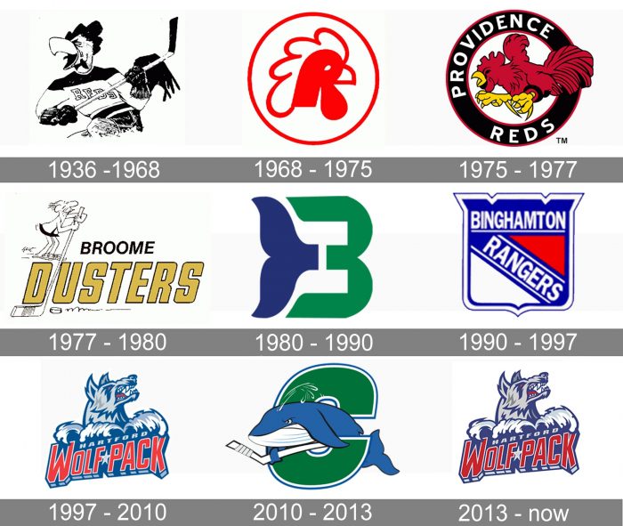
1936 — 1968
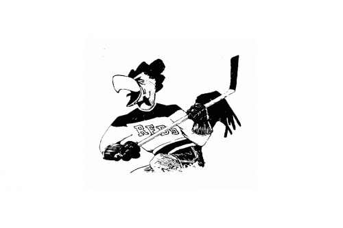
The very first logo for the club was designed in 1936 and stayed untouched for more than thirty years. It was a black and white caricature of a roaster in a hockey uniform and with a stick in its wing-hands. On the white part of the jersey, there was a strong uppercase “Reds” in a geometric serif font written diagonally. The bird looked cool and playful, perfectly reflecting the mood and spirit of the hockey club.
1968 — 1975
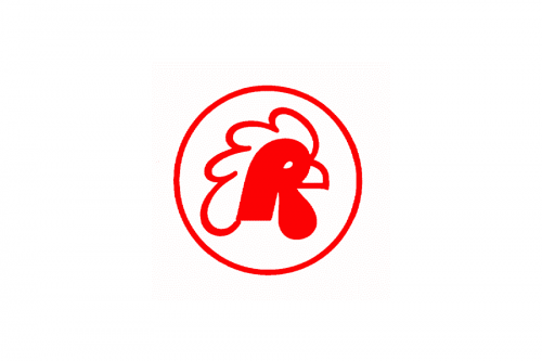
The redesign of 1968 introduced a new minimalist badge for the Reds. It was a red and white emblem with a stylized rooster profile picture set inside a red circular frame. The background and the details of the image were all white. The new color palette and smooth bold lines of the logo made the team look more confident and powerful, showing it as a serious and dangerous competitor.
1975 — 1977
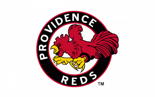
In 1975 the logo was redesigned again. The rooster was now drawn in full height, running to the left. It was executed in dark red and placed on a white circle enclosed into a thick black framing, where the white uppercase “Providence Reds” wordmark was written around the perimeter. The black framing was outlined in red from both inside and outside. Yellow was another color of the club’s new palette — used for the legs and the beak of the bird.
1977 — 1980
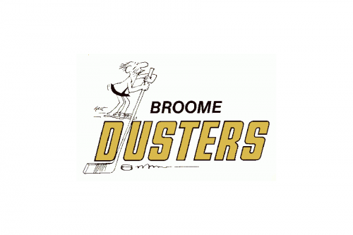
The name of the club was changed to Broome Dusters in 1977. The new logo in the black, white, and gold color palette was introduced in the same year. It was two-leveled lettering with a delicate funny image of a man with an elongated hockey stick set in the upper left corner of the badge. The top line of the inscription, “Broome”, was written in the uppercase of a classic sans-serif font, with its black letters slightly slanted. As for the main, “Dusters”, part of the logo, it was enlarged and executed in a narrowed italicized sans-serif font, with the bold golden letters outlined in black.
1980 — 1990

The logo, designed for the hockey club in 1980, was sleek and intense. The new minimalist approach featured a stylized capital letter “B”, formed by two fragments — the bright green right part with two tails elongated, pointed, and slightly curved, and the left part in blue, resembling a whale’s tail. The fragments were placed on a small white space between each other, which made the bold and bright emblem look lighter and fresher.
1990 — 1997
In 1990 the club took a new name — New York Rangers. And the new logo saw the light in the same year. It was a classy white, red and blue crest with two parts of inscription. The white uppercase “New York” was set on the upper part of the shield, underlined with white, and the diagonally set “Rangers”, which divided the main part of the crest into two triangles, white at the bottom and red on top.
1997 — 2010
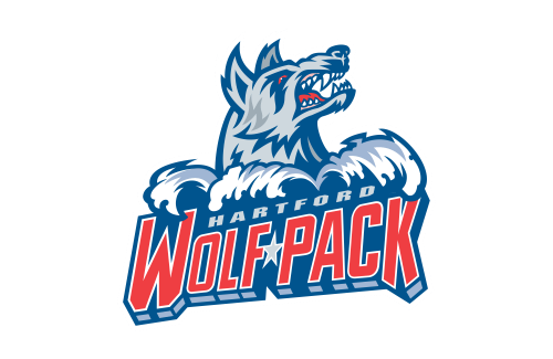
In 1997, the Hartford Wolf Pack logo was adopted with the image of a wolf. The animal’s mouth was open, and large, sharp teeth could be seen inside. His eyes looked scary due to their red color.
2010 — 2013
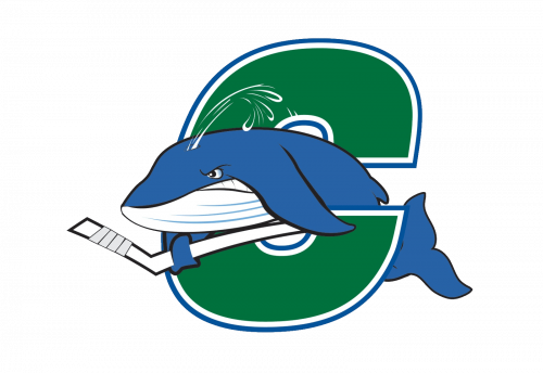
In 2010 the club started using another logo. It was completely different from all the previous versions, though used the color palette from the 1980s. The blue and green emblem, composed of a green extra-bold letter “C” and a blue whale swimming out of it to the left with a white hockey stick, looked cool and unique, making the club stand out in the list of its competitors.
2013 — Today
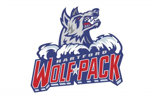
The Hartford Wolf Pack logo from 1977 came back in 2013. It was slightly refined and started looking stronger due to the use of an intensified and darkened color palette. The main colors remained the same, though the shades got stronger and deeper. The wolf became even more frightening and the wordmark — more eye-catching.
Colors
The logo features the combination of two shades of blue with two shades of grey, which creates an eye-catching 3D effect. Also, it’s a good background for the red details to stand out.


