As Hard Rock Cafe is part of a large family, including hotels and casinos, it partly shares its brand identity with the parent brand and its sister brands.
Meaning and history
The Hard Rock Cafe logo features optimistic yellow in combination with a brownish shade of orange and white.
The lettering “Hard Rock” features a custom type, which is both creative and legible. In the word “Hard” only the “H” looks unusual, due to the “unnecessary,” from the utilitarian point of view, stroke on the top. In the word “Rock,” the initial and the final letters have a unique touch. Due to the fact that the characters are capitalized, the design gets a dynamic feel.
Below the lettering “Hard Rock,” you can see the word “Café” in white. It features a simpler sans serif font made up of capital letters.
In the background, there is a circle with a border. Throughout the company’s history, the color of the border has varied from black and white to orange.
We should add that the parent logo is simpler. There is only the lettering “Hard Rock” in white over the white ring.
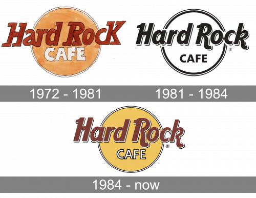
1972 – 1981
The creator of the original Hard Rock Cafe logo was Alan Aldridge, a British artist, graphic designer, and illustrator. His most notable design can be seen in books and on record covers by The Beatles and The Who.
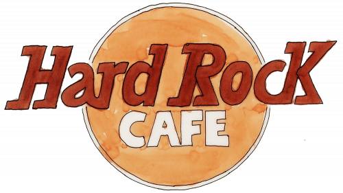
The earliest Hard Rock Cafe emblem looked pretty much like the current one, although there were a couple of notable differences. The type was rougher, the word “Café” was larger and featured a more casual style. The circle in the background looked as if it was colored with watercolors – you could distinguish the strokes.
1981 – 1984
In the 80s, it was decided to make the logo less childish and cartoonish. They made the lines and shapes more even, removed the crooked, disproportioned, unnecessary and otherwise ugly parts, and the made the whole thing black-and-white. The result was a more formal wordmark made in black and set onto a white plate with black framing.
1984 – Today
A few years later, they decided to relent and color their new logo. The letters in the main text part became syrup brown, much of the circle turned a pancake shade of yellow, and the ‘café’ part became just a black-framed white word.
Font and color
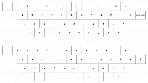
The iconic Hard Rock Cafe logo has been using one style of lettering for decades. Its custom bold typeface is based on a heavy italicized sans-serif, such as Lucifer Sans ExtraCondensed SemiBold Italic, but with the tails of the letters elongated and curved, adding playfulness and uniqueness to the letter shapes.
As for the color palette of the Hard Rock Cafe’s visual identity, it is composed of muted shades of brown and yellow, with delicate white details, adding some contrast and brightness to the composition. The palette looks calm and relaxed, making the logo look laconic and smooth.


