The Gulf Oil logo has always played a crucial role for the company. Even at the very beginning of its history, Gulf was among the companies using the idea of branded product sales. They offered gasoline in containers and from pumps showcasing the iconic “Orange Disc” logo.
Meaning and history
Gulf Oil was founded in 1901 and quickly became a major global oil company. For instance, in 1941, it was ranked the eighth-largest manufacturing company in the US, while in 1979, it was the ninth-largest.
A year after the merger with Standard Oil of California in 1985, the brand was relaunched under the name of Gulf Oil LP.
1920
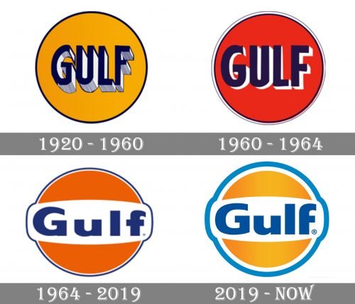
The orange disc was flat and had a black outline. The word “Gulf’ placed in the center was dark blue with white and gray shades. While the shades created a 3D style, they looked somewhat out of place when combined with the flat circle.
1960
The update slightly improved the situation. On the one hand, the shades in the word “Gulf” grew shorter. On the other, the circle also adopted a white, blue, and gray outline adding some depth. The orange grew darker and had a more visible red mixture.
1964
The color of the circle was modified once again. It now featured an appetizing shade characteristic of the orange fruit. The blue became a little more vivid. What was more notable, the white background appeared behind the lettering making it better legible. The type grew flatter and more rounded.
2019
The writing put on some more weight. The blue outline of the Gulf Oil logo grew bolder. The orange grew lighter and adopted a gradient effect adding some depth.


