The number of updates of the Gulf Air logo since the 1950s has reached at least eight.
Meaning and history
Gulf Air is the national airline of the Kingdom of Bahrain. Gulf Air has its origins in 1950. The airline began as a small commuter service serving the oil fields of the Persian Gulf.
The conclusion of codeshare agreements with British Midland and American Airlines made it possible to carry passenger traffic to London, New York, Chicago and Miami.
The headquarters of Gulf Air is located in the capital of the country – Manama, the main base is the international airport of Bahrain. In addition, the airline is the first Middle Eastern company to introduce an electronic check-in system. In 2004, it was awarded the title of the best aviation company in the Asia-Pacific region. In the same year air service was established between Dubai and London, as well as to Muscat, the capital of Oman.
Gulf Air has its own loyalty program Frequent Flye, where passengers earn miles and then redeem them for a variety of benefits. The program includes three levels: introductory, silver and gold. Gulf Air offers its passengers flights in two classes of service: economy and business class.
What is Gulf Air?
Gulf Air is the name of the national airline of the Kingdom of Bahrain, which began flying in 1950. It is not a member of any airline alliance and is based at Bahrain International Airport. Its fleet includes 28 aircrafts, which are various modifications of Airbus A320, A321 and A330.
1950
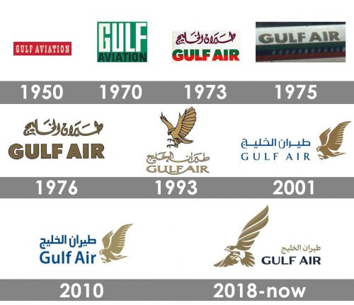
The original version featured the old name of the airline, “Gulf Aviation,” in a slab serif type. It was white against the red background.
1970
The serifs were gone, the red box was replaced by a green one.
1973
The upper parts of glyphs in the words “Gulf Air” were green, while the lower halves were red. The Arabic version was purple.
1976
The logo grew gold.
1993
A bird with its wings open appeared above the lettering, which was now given in a more elaborate and lighter type.
2001
There has been some playing around with the shape of the bird, the type, and the color of the wordmark.
2010

The redesign of 2010 was all about the wordmark. The color palette of the inscription got elevated and brightened, while the lines got thicker and the symbols themselves — wider and taller. As for the emblem, the eagle was still there, in the same style and shades.
2018
In 2018 the badge was redesigned again. The eagle was moved to the left from the lettering and redrawn. The bird now was depicted from another angle, and both of its sores wings are Joe see on the logo. As for the colors, this detail remained untouched.
Another change was done to the text part of the logotype. The upper Arabic line now used the same gold shade, while the bottom was made in a three-dimensional style, in two shades of muted blue color.
Font and color
The exquisite and elegant custom typeface of the Gulf Air logotype was designed exclusively for the brand but has something in common with such fonts as Aviano Flare Bold and Tinta Coated Bold, but with the contours and lines modified and slightly elongated.
The dark blue and gold color palette of the Gulf Air logo is a reflection of quality, excellence, and precision. The company with the badge in these shades looks like a reputable and professional one.


