Grubhub is a food-delivery service, which operates across the USA. The company was established in 2004 and has more than 20 million people using its mobile application.
Meaning and history
Grubhub was founded in 2004 by Matthew Maloney and Michael Evans as an alternative to paper menus. Who would have thought that 15 years after the app was founded, electronic menus would almost completely replace paper menus?
Starting in 2011, Grubhub began buying up various smaller companies in its sector, such as Dotmenu, which at the time owned Allmenus and Campusfood, and then Delivered Dish and bite.
In 2013, Grubhub merged its operations with Seamless, achieving a very impressive expansion of operations and increased revenues.In 2020, Grubhub was acquired by American company Just Eat Takeaway for7.3 billion USD.
What is Grubhub?
Grubhub is the name of a food delivery service, which was established in the United States in 2004. The company is headquartered in Chicago, Illinois, and has its services available all over the United States and the United Kingdom.
2004 — 2011

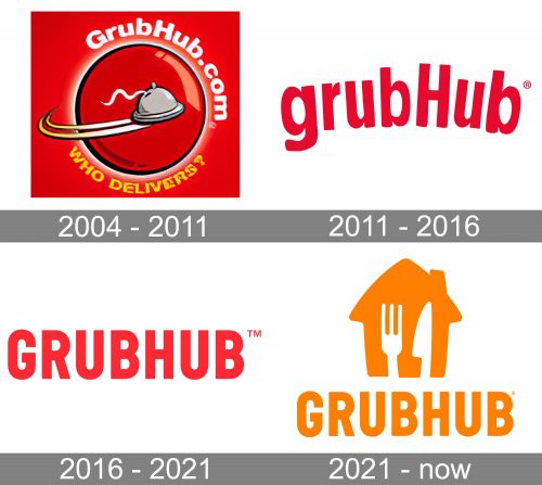
The very first GrubHub logo was introduced in 2004, with the launch of the service, and stayed with it for almost seven years. It was a simple yet bright emblem with the plate and website name as two main elements. The logo featured a solid red square with the glossy red circle in a thin outline placed in the center. The circle was supposed to represent the planet and had a gray plate “flying” around it, with white and orange curved orbits on the left. The upper part of the circle was arched with the white website address in a bold rounded sans-serif, white the bottom part featured a yellow “Who Delivers?” The tagline is in a stylized font, with the edges and texture slightly uneven.
2011 — 2016
The previous Grubhub logo, designed in 2004, was text-based, but used mainly lowercase lettering, except one capital “H”. The color palette was based on a darker shade of red and the wordmark was arched. Today the logo is refined and has maximum power in it, but is still based on the original one.
2016 — 2021
The Grubhub visual identity is laconic but bright. The company’s logo is composed of a wordmark, which is colored red and placed on a white background.
All capital letters of the inscription are written in a strong sans-serif typeface with condensed sleek lines. For the icon brand uses just two letters, “GH”, in white on a red background. The letters on the icon are placed slightly diagonally, which created a nice angular visual effect.
The Grub visual identity was redesigned in 2016 by one of the most famous American design bureaus, Wolff Olins. They made the logo modern and powerful, with the energetic color combination it looks stylish and memorable.
2021 — Today
The redesign of 2021 added a large graphical detail to the GrubHub logotype and changed the color palette of the entire badge. Now the emblem features an orange and white combination, which evokes a sense of joy, happiness, and positive energy. The logotype kept the typeface from the previous version and now was placed under the graphical element — a solid orange house silhouette with a white fork and knife drawn on it vertically. A very simple yet meaningful image, which looks friendly and reflects the purpose of the service. More than enough.
Font and Color
The heavy narrowed uppercase lettering from the primary badge of Grubhub is set in a modern sans-serif typeface with the capital characters executed in thick smooth lines. The closest fonts to the one, used in this insignia, are, probably, Wilma Base, or Skate Sans, with some barely noticeable modifications of the letters’ contours.
As for the color palette of the GrubHub visual identity, it is based on a bright and warm combination of orange and white, which evokes a sense of friendliness and coziness. Orange is a shade of energy and happiness, which also represents a warm house and hospitality, evoking a very welcoming feeling. The white here is a symbol of loyalty and safety, representing the confidence and responsibility of the company.


