Google Maps is an online service, created by Google in 2005 in order to give its users an opportunity to explore the globe through their devices. The mapping platform offers not only satellite bird-eye views, but also provide the street views and public transport timetables.
Meaning and history
Like all Google products, the Google Maps service has its visual identity fully based on corporate colors. The logo, composed of a wordmark and an emblem on its left is complemented by a separate icon, which is the most recognizable part of the software’s image.
2005
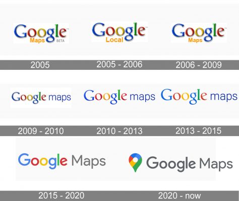
Created in 2005, the service had its logo designed in the same year. It was an iconic multicolor Google logotype with the delicate yellow “Maps” underline. The very first version also included a gray “Beta” lettering under the wordmark.
2005 — 2006

You can also come across a version, where the word “Local” was used instead of the word “Map.” The color, the font, and the position of the word in the logo have remained the same, though. In this version, the word “Beta” wasn’t used.
2006 — 2009
Later, the company returned to the lettering “Maps.”
2009 — 2010
In 2009 the “Maps” part was moved to the right of the main wordmark. The style and color were changed. Now it was written in all the lowercase letters in bright blue. In the same year, the first icon was designed.
2010 — 2015

This version is flatter due to the disappearance of the shades. And yet, it still preserves some dimension and some of the gradient.
2013 — 2015

Here, the gradient was almost gone, due to which the wordmark was almost flat. However, the shape added some depth.
Also, there was an alternative design. Here, the image of an unfolded map was placed inside a square with rounded angles. The light blue three-dimensional location dot was on its upper left corner. In 2012 the dot was replaced by a red location flag, and a little later the 3D map was changed to a flat and brighter image.
The main logo was also slightly refined throughout the years — the blue of the “Maps” turned into purple and the “Google” logotype had its contours cleaned and colors more intense.
2015 — 2020

The typeface was changed to a stronger and more modern sans-serif, and the “Maps” part was now written in a title case using a light gray color, which added professionalism and reliability to the whole visual identity.
In the full logo with the icon, the location mark was enlarged and made brighter. There was also a separate icon for Chrome designed — the rounded map with a capital white “G” on the left and a red location flag on the right.
2020 — Today
The redesign of 2020 brought the emblem to the main logo. Now a colorful location marker is placed on the left of the gray “Google Maps” inscription. It looks minimalist and simple yet evokes a sense of quality and expertise. The mark is executed in red, yellow, green and two shades of blue, the signature Google colors, and has a delicate white dot in the middle.
There are also two new icon designs, created in the same year. One of the features only the colorful emblem, placed on a white background, while the second icon is composed of a white square with rounded angles, and a smaller emblem, placed above the blue thick stripe with the upper side arched. The white “Go” lettering in all capitals is placed in the center of the blue stripe.
Icon
For different operating systems Google Maps has different iconic, though both of them are instantly recognizable and can not be messed up with any other brand.
Version number one of Google Maps Icon is a simple location mark symbol, set on a white or a light gray square background. The pin is executed in the corporate color palette, with green taking the most space, and red — the least.
Another version is a more colorful one, with the green, yellow, gray, and blue geometric background, imitation of the street map, and a solid red location mark.


