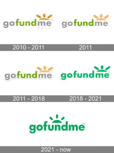
GoFundMe has been pretty loyal to its original brand identity. The modifications the logo went through reflect the tendency towards minimalism characteristic of modern logo design.
Meaning and history

While the brand was officially launched in the spring of 2010, its history can be traced back to the website CreateAFund created two years earlier by Brad Damphousse and Andrew Ballester. Essentially, GoFundMe was the same service with a new name and several crucial modifications.
What is GoFundMe?
The brand describes itself as the world’s largest social fundraising platform. It gives people an opportunity to collect money for their personal causes, from celebrations and graduations to accidents and illnesses. As of 2020, there were more than $9 billion raised, while the number of donations exceeded 120 million.
2010 – 2011
The very first GoFundMe badge was designed in 2010 and stayed active for several months. It was a bold lowercase inscription in a heavy sans-serif font with the “Go” and “Me” set in gray, and the “Fund” — in green. The inscription was accompanied by an image of a rising sun in orange, placed above the two last letters, with three bold rounded rays coming out of it. The composition was underlined by a lightweight gray “Beta” lettering in the uppercase of a simple sans-serif type.
2011
The redesign of 2011 has introduced a refined version of the GoFundMe badge, withcleaner contours of the characters and the graphical element, and a brighter shade of green, while the orange of the sun got lighter and gained some white gradients, which added a sense of volume and dynamics to the composition. This version of the GoFundMe logo has stayed active for just a few months.
2011 – 2018
The original logotype showcases the name of the brand, which is the most prominent element of the design. As there are no spaces between the words forming the brand’s name and the letters are lowercase, deciphering the wordmark could have presented a problem. This is why the company colored each part of its name in a different way to create a visual border between them and to let people easier grasp the meaning.
Also, the glyphs have a white outline with shades making them look more dimensional.
The pictorial part is rather modest in terms of the space it occupies, but it is vivid and eye-catching. Right above the word “me,” there’s a part of a circle and three lines. The color of the icon and its shape suggest that it’s the rising sun. Alternatively, it can be interpreted as a symbol of people who join their efforts.
2018 – 2021

The design grew simpler due to several updates. To begin with, the authors of the logo left only a single color, green, instead of the combination of green, gray, and orange used in the previous version. On the one hand, it is now harder to break the name of the brand down into meaningful parts and it comes as a long and difficult-to-digest word. On the other hand, the brand is already familiar to many people, so this might be less of an issue now. The shade of green is slightly cooler than the one used in the previous version.
Another notable alteration is the disappearance of the white outline and shades. This resulted in a flat design.
2021 – Today
In 2021 the GoFundMe logo was redesigned again, with the green color darkened up and intensified, and the sun emblem moved to the center of the inscription. Now the graphical element is placed above the letter “N”, with its sides spread to the “U” and “D”. As for the new shade of green, it adds confidence and a sense of reliability to the badge.
Colors and font
The palette is utterly simple, with one color, green, present in the design, apart from the white background. Green is the color of many things that grow. Here, it may be generally interpreted as a symbol of the opportunities for growth provided for the participants. Additionally, it is a long-standing symbol of hope, which also perfectly fits the agenda.
The GoFundMe logo is set in a lowercase sans with classic proportions providing excellent legibility.


