Glitch is the name of an online portal, created by Fog Creek in 2000 for everyone interested in coding and application design. The platform aims to provide everyone with the easiest and most innovative tools for app creation. By today Glitch has grown into a huge community with millions of users from all over the globe, and an application portfolio of more than three million apps.
Meaning and history
Like most ingenious products, Glitch was created to make life easier for modern people. The platform, designed to make app development accessible to a wide range of people and to minimize preparatory work, has become incredibly popular.
The service works on almost any device and operating system, so it is even possible to edit code from tablets and phones, and the app will automatically update when these changes are made.
Created in early 2016 by the famous company Fog Creek, the Glitch service (original name – Gomix) began to gain an audience by the end of 2016. An active user base emerged, and those users had their first projects made using the new methods. Today the platform has more applications than the AppStore.
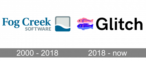
2000 – 2018
The glitch was created as a product of the Fog Creek company and was originally called Gomix, although got renamed fast enough and for the first years was using the mother company logo for its identity. It was a classy and modest badge, composed of a bold serif logotype in calm sea-blue color with the light gray uppercase “Software” tagline in a stable and strong Sans-serif font. The wordmark was set on the left from the emblem, which looked like a square with rounded angles, drawn in gray and blue, with the sleek white wave separating the upper part from the bottom one.
2018 – Today
In 2018 Fog Creek decides to rename the company to Glitch, and this is when a new super stylish and bright logo was created. The new badge features a lovely colorful emblem, depicting two similar fish placed one above another and facing to the left. The upper fish is drawn in two shades of pink with blue details, while the bottom one has its body in two shades of blue and the details — in pink. The emblem can be used on its own (for the web icon) or placed on the left from the logotype. There are two options for the color palette of the badge — black lettering on a white background, or the reverse version, with both the fish emblem and the white inscription set on a plain black rectangle.
Font and color
The bold title case Glitch logotype is executed in a custom sans-serif typeface, which is based on such fonts as Cardium C Semi Bold and Draft C Semi Bold, but with the contours of some letters modified. The bold square arrow on the end of the “G”, a sharp diagonal cut of the “T” vertical bar, and the smoothly curved tail of “L” are what make the inscription unique and recognizable.
As for the color palette of the badge, the black-and-white “basement” of the logo, which represents professionalism and reliability, is balanced by lively vivid pink and blue fish emblem, standing for creativity, art, and friendliness. The colors of the logo are balanced and make the badge instantly recognizable and memorable.


