The original Gillette logo definitely looks dated, which is hardly a surprise taking into consideration it was created around 120 years ago.
Meaning and history
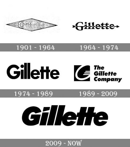
In 1901, King Kemp Gillette radically improved the quality of shaving when he invented the world’s first safety razor. This is how the famous Gillette brand was born, a shortly after it introduced its time-honored motto: “There is a better way to shave, and we will find it.” Already in 1904 the Gillette invention was patented.
In 2005, the brand was bought by the world-famous Procter & Gamble for 57 billion USD. This deal is one of the largest in history. Today Gillette owns 64 production facilities in 27 countries. Products are sold in more than 200 countries. Almost half of the sales are in the United States, the rest – outside of it.
What is Gillette?
Gillette is the name of a brand that is a world leader in the category of products for personal hygiene and facial and body care. The brand, beloved by men around the world, was founded in 1901 and today is part of Procter & Gamble, one of the largest global players on the personal hygiene market.
1901
The word “Gillette” here was lowercase except for the initial. The type was a traditional one, with classic proportions. And yet, there was something decorative about it, too: the curves on the top ends of the “l’s” and the “G,” the unusual “t’s.” Still, it was not the type what made the design unique but the arrow going through the letters. The arrow was used as a symbol of the sharpness of Gillette razors. The logo was placed inside a rhombus.
1964
The core visual metaphor remained unchanged. You could still see a sharp arrow that had flown through all the letters leaving holes in each of them. There were even similar elements in the typeface. And yet, the letters were now solid black. The “G” featured a completely different shape.
Also, during this period, a corporate roundel emblem was introduced. There was a thin black ring with the white filling. There were three short bars positioned close to the right part of the circle. Next to the ring, the lettering “The Gillette Company” in a generic sans could be seen. The letters were quite small, and thus hardly legible at smaller sizes.
1974
The arrow disappears, the type grows bolder. The shape of the glyphs has gone through a complete overhaul. The designer has introduced a visual rhythm to the logo by emphasizing the double letters. This is especially noticeable in the case of the “t’s” – their horizontal bars merge forming a single bar. This approach has been used in the wordmark ever since.
While in most countries the design was updated in 1989, this version was still in use in other countries as late as in 1992.
Although the wordmark has grown much better legible, we cannot say it looks unique or contains any indications on the product the company manufactures. In the following versions, the designers have tried to solve these problems.
1989
This is when the prototype of the current Gillette logo appeared. In comparison with the previous wordmark (1974), this version is noticeably bolder. Also, the letters are capitalized. The breathing space between the glyphs has grown smaller. In fact, the second “l” and the first “e” stick together. The same can be said about the “e’s” and the “t’s.” A version with more generous breathing space between the letters was introduced, too.
2009
The dot above the “I” was replaced by an asymmetric shape. If you take a closer look at its lower side, as well as the top end of the letter “G,” you will notice they look as if they have been sliced at an angle (similar to the way you can cut your fingertip with a razor).
Font and color
The bold title case lettering from the primary Gillette logo is set in a stylized geometric sans-serif font with the dot above the “I” replaced by a trapezoid blade. The closest fonts to the one, used in this insignia, are, probably, Intervogue Alt Ultra Oblique, or Lightbox 21 Black Oblique, with some modifications of the “G” and the “T”s.
As for the color palette of Gillette’s visual identity, it uses two possible options: plain black on white, which is timeless and always an actual choice, and dark blue on white, which looks interesting and evokes a sense of cleanliness and freshness.


