The Gett logo is memorable, meaningful, and eye-catching.
Meaning and history
Gett is an international taxi-calling service that was launched in Israel in 2010 and was initially called GetTaxi.Gett allows you to call a cab at the touch of a button on your smartphone – through a mobile app. The servicehas its call center and quality control of cab drivers. It earns money on commission per order.
Gett was founded in Israel and came out to the international market fast, expanding its taxi services to the United Kingdom, the USA, and Russia. Today the application is also available in several European countries.
What is Gett?
Gett is the name of an Israeli mobile app, which offers its users taxi services. The application was developed in 2010 under the name GetTaxi. Today Gett is available in several countries across the globe, including the European continent; Israel, Russia, and the United States.
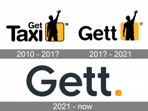
2010 – 201?

The dark male figure is somewhat intriguing, too – if you do not know what type of company the emblem belongs to, you may be curious to find out.
201? – 2021
 The previous version was even more explicit as it included the word “Taxi,” which reflected the brand’s original name “Get Taxi.” The man on the logo looked a bit less slim than on the current one, and there was also a thin black outline on the square.
2021 – now

The 2021 logo design depicts the name inscription without the emblem. The letters are similar in appearance, but less round, a bit stricter and without an extra vertical stroke in ‘G’ that made it look like an arrow. The color also switched to grey instead of black. All that is left of the orange emblem is a small orange dot next to the wordmark.
Company overview
Gett is an online platform specializing in ride-hailing, taxi, chauffeur, and limousine services for corporates. The company had 964 employees (2019) and a revenue of $ 1.0 billion (2017).
Font
The streamlined type with rounded ends makes the Gett logo perfectly legible and friendly. The “G” is the highlight of the design – the detail on its lower end is, in fact, an arrow, which adds some motion and meaning symbolizing speedy service.


