Galatasaray is the name of a professional football club from Turkey, which was established in 1905, and today is in the top ten of the Turkish Super Lig. The club, nicknamed The Lions, is owned by Mustafa Cengiz and has Fatih Terim as the head coach.
Meaning and history
The visual identity of the Turkish professional football team hasn’t had a very intense history. Being a club, born in one of the great cradles of civilization, Galatasaray shows its value of cultural legacy and traditions in its logo, which was only changed once.
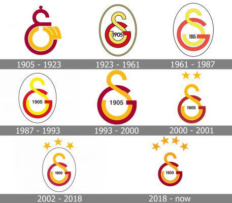
1905 – 1923
The original Galatasaray emblem was introduced in 1905, right after the club’s establishment, and featured a stylized red and orange badge, composed of two symbols, standing for the first Turkish letters of the team’s name. It was a burgundy red big letter, resembling a Latin “E” in cursive” with a small solid dot sitting on its top, and a key-like symbol in dark-yellow, or orange, placed inside the bottom part of the bigger letter.
The emblem looked very sophisticated yet bold and modern, and its color palette has the club their “Lions” nickname, showing courage, determination, and power.
1923 — 1961
The redesign of 1925 changed the Turkish letters of the logo to the Latin ones, which made up a new GS monogram. Now the badge was composed of an enlarged yellow “S” in a thin black outline, and a red “G” intertwined with the “S” bottom part. The black “1905” datemark was placed inside the white circle formed by the lines of the letters.
1961 — 1987
In 1961 the lines of the monogram became thinner and longer, and the black outline became almost invisible. The black datemark was narrowed and placed a bit lower than on the previous version, leaving more white space on the emblem, and making it airy.
1987 — 1993
The redesign of 1987 made the letters glued again, but this time red “G” and yellow “S” had their outlines removed. The black “1905”, celebrating the year of the club’s establishment, was again placed in the middle of the monogram’s bottom part, written in full shapes and thick confident lines.
1993 — 2000
The Galatasaray logo was slightly refined in 1993. This year only brought a darker shade of yellow to the “S”, keeping all other elements untouched. With the elevated color palette, the emblem of the club started looking more solid and confident, resembling the lion’s colors even more now.
2000 — 2001
In 2000 the club brings back its original color palette, with burgundy-red and dark-yellow shades, and placed two solid yellow five-pointed stars on top of the badge, to celebrate the wind of the team. As for the black datemark, it remains in its place and still used the same style.
2002 — 2018
The redesign of 2002 placed the monogram into an oval frame, with a very thin black contour. The two yellow stars were now accompanied by one more, and placed over the frame of the logo, creating an arched “crown” above the badge and adding a sense of strength and precision.
2019 — Today
In 2019 the fourth star was added to the Galatasaray visual identity, and the color palette was slightly refined again. The color of the “G” became more intense and dark, looking Royal and chic, and making the whole badge powerful and elegant.
Font and color
The Turkish football club prefers using its badge without any lettering, but when they have to — the Galatasaray logotype is usually executed in a strict and strong sans-serif typeface, with all uppercase letters in thick lines and solid shapes. The font of the club’s wordmark is very close to such types as Corner Deli T and Bebas Neue, but with some lines modified.
As for the color palette, the Galatasaray visual identity has been using a red and yellow combination from the very first days. It is a scheme, representing passion and energy, along with determination, progressiveness and reliability of the club, and their willingness and ability to fight.
Galatasaray Colors
RED
PANTONE: 187 XGC
HEX COLOR: #A90432
RGB: (169, 4, 50)
CMYK: (0, 98, 70, 34)
YELLOW
PANTONE: 123 C
HEX COLOR: #FDB912
RGB: (253, 185, 18)
CMYK: (0, 27, 93, 1)


