Furniture Village is a renowned UK-based furniture retailer specializing in a wide range of home furnishings. Established in 1989, the company was founded by Peter Harrison, who aimed to create a store offering a wide variety of furniture under one roof. Furniture Village operates predominantly in the United Kingdom, boasting a significant presence with numerous stores spread across the country.
Meaning and history
The company’s foundation by Peter Harrison marked a significant moment in the UK furniture retail market. Under his guidance, Furniture Village expanded rapidly, becoming known for its diverse range of quality furniture, including sofas, beds, dining room sets, and other home accessories. One of the key achievements of Furniture Village has been its commitment to customer service and satisfaction, which has played a crucial role in its growth and popularity.
In its current position, Furniture Village continues to thrive as a leading furniture retailer. It has adapted to the modern retail environment by integrating online shopping options with its traditional brick-and-mortar stores. The company remains committed to providing high-quality furniture and excellent customer service, while also focusing on sustainable practices and responsible sourcing of materials. As of now, Furniture Village stands as a prominent and respected name in the UK furniture retail industry.
1989 – 1998
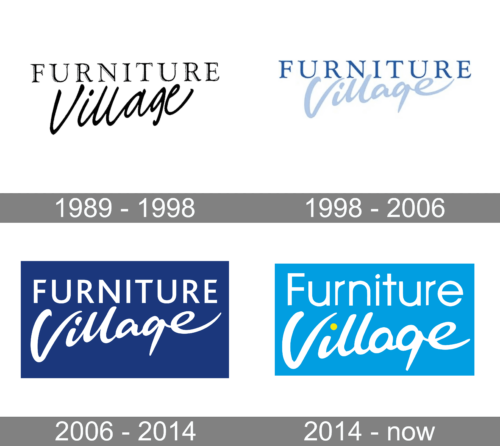
The logo is a sophisticated and elegant text-based design that features the name of the company, “Furniture Village.” The typography used for “Furniture” is more understated and modest, likely to symbolize stability and reliability. In contrast, the word “Village” is written in a more flowing and cursive script, which adds a touch of sophistication and personal touch, suggesting that while the company may be large, it values a sense of community and personal service. The overall design is monochromatic, giving it a classic and timeless feel. The choice of script for “Village” gives the logo a sense of flair and individuality, setting it apart from more generic corporate identities.
1998 – 2006
The logo presents the name “Furniture Village” in a crisp, serene blue hue that conveys a sense of trust and professionalism. The font used for “Furniture” is clean and modern, with a sans-serif style that speaks to the company’s contemporary approach to furniture retail. The word “Village,” written in a graceful, italicized script, contrasts with the straightforwardness of “Furniture,” implying a fusion of modernity with a personal, community-focused touch. When compared to the previous logo, the use of color here adds a dimension of approachability, while the consistent font style maintains a cohesive and recognizable brand identity.
2006 – 2014
The emblem portrays “Furniture Village” against a sapphire backdrop, reminiscent of the evening sky just after sunset. The first word, “Furniture,” is crafted with substantial, capitalized letters that suggest a robust, no-nonsense approach, exuding confidence and modernity in their sans-serif stature. Below, “Village” flows with an airy, cursive elegance, its white strokes conveying a sense of finesse and community warmth, as though it were a signature on a heartfelt letter. This artful blend of fonts captures the essence of the brand’s identity: a foundation of sturdy, modern values coupled with the grace of traditional, personalized customer service. The deep blue hue is both regal and dependable, a visual anchor for the company’s steadfast reputation in the furnishings realm.
2014 – Today
The logo showcases the name “Furniture Village” with a vibrant, sky-blue backdrop. “Furniture” is in a bold, sans-serif typeface that suggests modernity and straightforwardness, while “Village” is in a playful, cursive style, giving a sense of friendliness and warmth. A notable addition is the small yellow dot above the ‘i’ in “Village,” which may symbolize a sun or light, indicating positivity and brightness. When compared to the previous iteration, this logo retains the contrast between the two words but introduces a lighter shade of blue and the yellow dot, which adds a splash of energy and optimism to the brand’s visual identity.


