Flipgrid is social media, established in 2014 and held by Microsoft. The user’s operations on Flipgrid platform take place in special rooms, accessible for everyone by invitation. The core instrument of the platform is short videos, 15 to 90 seconds long. These videos are called responses. You can customize your response with a variety of filters, visual effects, stickers, and many other tools making it more colorful and vivid. Now, the Flipgrid social platform is widely recognized amidst the teachers and parents who want to keep in touch with their students and children who got used to TikTok format of videos.
Meaning and history
Flipgrid was launched in 2014 by an associate professor of University of Minnesota named Charles Miller. He founded this video-discussion platform in order to engage his students in educational process using short videos. With these videos, students could exchange notes about lessons, help each other with tests and homework, as well as talk with professors. Then, the Flipgrid system became popular. It was bought by Microsoft and spread across the whole world. In general, it was always used by the teachers and professors, who want to share information with their students by the most efficient and comfortable way for everyone.
What is Flipgrid?
Flipgrid is a social media, established in 2014 by professors from University of Minnesota. It is a social platform, which helps people from any corner of the world talk to each other using short videos, 15 to 90 seconds long. They’re customizable: you can add filters, stickers, reactions, and other modifications while post-producing your video. All activities in Flipgrid take place in rooms, created by users, who can also send invitations to each other. The Flipgrid target audience is professors, teachers, coaches, and parents who want to communicate with their students or children using a popular format of short videos.
2014 – 2016
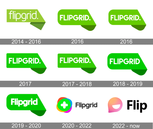
The original logotype of Flipgrid depicts a green rectangle with a nameplate on it. The top right corner of the shape was laid down, so the entire right ending of the rectangle was tilted below. The watermark had a soft sans-serif typeface with rounded lowercase letters
2016 – 2016
In 2016, they renovated the logo. The rectangle became brighter, and its angles became rounded. The name got an uppercase font with narrower gaps between large bold letters. However, this logo hadn’t lived for a long – Flipgrid Company had been using it for only 5 months, from July to December.
2016 – 2016
In December 2016, the brand designers of the company had changed the logotype of the brand once again. It was narrowed and downsized, while the elements hadn’t changed. This is the most short-lasting logotype in the Flipgrid logo history. It was in use for just a month.
2017 – 2017
In the next month, the new logotype was brought to the company. It was the similar rectangle, but slightly enlarged.
2017 – 2018
In August 2017 the Flipgrid mark was changed once again. It received a brighter shade of green. The folded part of the shape had changed the coloring. If in the previous logotypes it was dark green, now its palette mixed dark blue and dark green shades. The inscription with the name of the brand also gained a new type. It had way bolder lines than previously.
2018 – 2019
In the following logotype, the dot was removed from the ending of the lettering. The inscription itself became smaller. As for the rectangle, so its corners became more rounded, while its tilted part was turned back to dark green painting.
2019 – 2020
Then, the new variation of the rectangle and the nameplate was brought to the company. The rectangle became brighter, and its left corners were made even more rounded. The design team of the company had used a typeface with lowercase letters (except for the first F). The gaps became even fewer than in the previous versions, and the central ‘p’ and ‘g’ were completely connected.
2020 – 2022
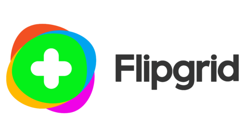
The 2020 edition of the brand logotype depicts the familiar inscription downsized and placed to the right side from the emblem. The emblem itself consists of multiple ovals, crossing each other and forming a circle at the center of the emblem. In the circle, the designers have drawn a plus sign.
2022 – Today
Font
Since 2020 logotype, the corporate design team has been using a soft sans-serif typeface for the lettering. The characters have very small gaps in between, due to which the nameplate takes up less space. The letters of the name have a typical general appearance.
Color
The brand uses a multicolored palette. For the name, it’s using a solid black shade, while the emblem, consisting of many ovals, has a variety of colors. At the perimeter of the emblem, there are four petals. They’re colored red, blue, yellow, and pink. At the center, there is a green circle with a white crest on it.


