Exelon Corporation has been known as America’s largest electric parent company and the largest regulated electric utility. While the headquarters are in Chicago, Illinois, the company is incorporated in Pennsylvania.
Meaning and history
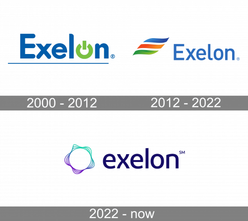
In the old Exelon logo, the energy theme was more obvious. The logo introduced in 2012, in its turn, looks more vivid and dynamic.
What is Exelon
Exelon is an energy company with roughly 10 million customers. It is part of the Fortune 100 list and has around 33,400 employees.
1990s – 2000
In its modern form, Exelon was established only in 2000. However, the history of the brand name itself can be traced back to a little earlier, when there was a PECO subsidiary of the same name. It used a wordmark logo, where the “O” glyph was formed by a red sunburst. The sun is a universal symbol of energy, so the symbolism behind the old logo was utterly transparent.
2000 – 2012
In the fall of 2000, PECO Energy Company of Philadelphia merged with Unicom Corp of Chicago to form Exelon in its modern form. The new company was headquartered in Chicago, where Unicom was previously based.
In the logo introduced in 2000, there were both a wordmark and an emblem. However, the emblem wasn’t placed somewhere near the wordmark, but was included in it to form a single whole. It wasn’t a really individual emblem but a generic power symbol like the one place on personal computers, for instance, to indicate that a control activates or deactivates a particular device. It is an open circle with a white gap in its top part. In between the two ends of the circle, there was a rectangle standing on its narrow part. The power symbol forms the “o” glyph in the name of the company.
The other glyphs have a more regular shape, although there is still a slightly unusual touch. You can see it in the way the letters combine rounded ends with rectangular ones and even with a combination of acute and obtuse angles. For instance, the lower ends of the “x” are rounded, whereas the top ends combine acute and obtuse angles. The same is true for other letters.
Below the wordmark, a thin line can be seen.
While this logo creates a rather straightforward link with the power and energy themes, it lacks individuality. Even the fact that a rather unique shade of green is used as an accent doesn’t save it.
The 2000 Exelon logo was created by Kass Uehling, a brand agency led by Milt Kass. As of 2021, it is showcased in the portfolio section of the agency. The two companies that merged to form Exelon, Commonwealth Edison, and PECO Energy, also had had their visual brand identities developed in collaboration with Kass Uehling.
2012 – 2022
The new version of the logo was created by FutureBrand New York. While preserving some of the features of its predecessor, this one breaks new ground. In addition to blue and green, a bright orange shade is used. It is part of a dynamic emblem combining three swooshes of different colors.
The blue wordmark is still there, and even the proportions of the letters look pretty much the same. They are slightly taller now, and the ends of the letters have a classic rectangular shape.
2022 – Today
The redesign of 2022 has introduced a sleek and modern logo for Exelon. The new concept features a combination of a lightweight abstract emblem in purple-to-turquoise gradients, and a bold lowercase logotype in a smooth yet strong sans-serif font. The emblem of the company boasts a white circle in a wavy outline, formed by four gradient lines. As for the lettering, its clean and stable sans-serif characters are set in a modern font, with straight cuts and slightly arched bars of the “X”. The inscription is executed in a calm and dark shade of purple.
Colors and font
Orange, as the color of fire, seems a rather logical choice for an energy company logo. Blue is used by many energy companies as it is the color of natural gas. However, here, there might be an additional reason – blue conveys purity as the color of the water. Interestingly, it is combined with green, the color of leaves and grass.
In other words, the palette of the Exelon logo seems to claim “pure nature” and imply that the company is eco-friendly, in spite of the obvious question mark over the real state of affairs. Everyone can see why the brand is trying to do this.


