Eurosport is the name of a Discovery sports channel, which was established in 1989 and today is one of the main sports news providers in the world. The channel broadcasts all the most important sport-related events and championships and has a huge audience all over the globe.
Meaning and history
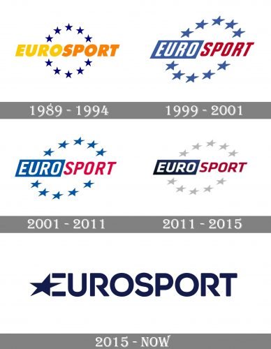
Though the famous sports tv-channel has had four official redesigns of its visual identity, the history of its logo can be split just in two periods — from 1989 to 2015 and the modern era, started in 2015.
1989 – 1994
The very first logo, introduced in 1989, was composed of a yellow and orange inscription in all capitals, and a circle, consisting of ten solid blue stars. The inscription was executed in a j by old italicized sans-serif typeface, which looked very dynamic.
1994 – 2001
The redesign of 1994 brought a new color palette to the Eurosport visual identity. Now it was colored in blue, red, and white, with blue a bit lighter than on the previous version. The wordmark was split into two parts — the white “Euro” placed inside a blue rectangle and the red “Sport” without any framing. The star circle was now diagonally oriented.
2001 – 2011
The typeface of the wordmark became more solid and strict, getting more space between and inside the letters. The color palette remained the same, but the blue gained a more intense shade. This logo stayed with the channel for ten years.
2011 – 2015
The visual identity was refined again in 2011 by adding a new color — light gray, which was used for the stars. The main inscription kept its composition but was now drawn in a darker palette.
2015 – Today
The new era of visual identity design started for the channel in 2015. A completely new idea was introduced — the current Eurosport logo is a simple inscription in all capitals with a star placed near the first letter and one of its rays replacing the horizontal bar of the “E”.
Font and color
The deep blue logotype, which is usually placed on a white background, evokes a sense of trustworthiness and loyalty, covered with professionalism and confidence, which are very important for the channel with a strong reputation.
The typeface of the logotype is very close to such well-known and widely used fonts as Integral CF Regular and Posterama Pro 1984 SemiBold, but with the contour of the letter “R” modified. Complemented by a star in the “E”, the inscription looks unique and the typeface — fancy and elegant.


