The American-based (San Francisco) Esurance Insurance Services, Inc. sells different types of insurance ‒ auto, motorcycle, renters, and home by phone or online directly to consumers. It has been in business since 1998. At first the company was wholly independent, but since 2000 it has had different owners. Now it is Allstate’s subsidiary.
Meaning and history
Esurance is among the leading auto insurance companies in the United States. There have been two versions of its logo, and they have always been familiar to customers.
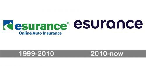
1999 – 2010
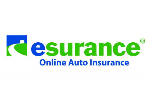
Until 2010 the Esurance insurance logo consisted of an icon and a wordmark placed to the right of it, everything in blue, green and white. Such a color palette was to create a feeling of security and friendliness. The icon depicted a white road running in the green field and disappearing in the blue horizon. There was also a round element that looked like a setting sun. For this reason the company’s logo was sometimes called a sunset logo.
The wordmark was the company’s name ‒ “Esurance Online Auto Insurance”. “Esurance” was in lowercase letterforms including the first letter “e” which was in blue color while all the other letters were green. “Online Auto Insurance” was written underneath. It was in blue and in a smaller font.
2010 – Today
With time the insurer felt dissatisfied with its insignia. The company continued to grow, and their aim was to expand the target customer base. So in 2010 it revamped its old logo. It seemed inappropriate with its generic icon and clunky typography. It could have implied numerous other companies. The new identity for Esurance including the logo was created by Duncan/Channon that was based in San Francisco as well.
The result was a very laconic mark ‒ just the word “esurance” in black color, simple, but smart. The message is delivered entirely by the typeface.
Depicted in all lowercase, rounded sans serif letterforms the logo is easily remembered, though dozens of other companies have the same features in their logos. Yet, there is nothing in the logo that would point to “auto insurance”. If anybody didn’t know the company and the specific of its work, they would never suspect anything looking at this wordmark.
The simplified Esurance insurance logo communicates the idea that the company constantly looks for ways to simplify the process of acquiring and using its service, to make it more convenient, even intuitive.


