Espanyol is the name of a Spanish football club, which was established in 1900 in Barcelona. The team with the full name “Reial Club Deportiu Espanyol” is nicknamed “Magical” (which is “Mágico” in Spanish) and is coached by Vicente Moreno.
Meaning and history
The visual identity of the Spanish football club has been redesigned many times throughout the club’s history, but the concept, from which the current logo was born, was created in the 1930s, and modified by today.
1900 — 1902
The very first logo for the club was designed in 1900 when its name was Club Español de Fútbol. The badge was composed of red and yellow football with the “CEF” lettering on it. It was simple, yet very brights
1902 — 1910
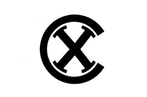
In 1902 the club changes its name to “X Sporting Club” and the logo is being dra-matically changes — the black stylized “X” is placed inside the black “C”. A very modern and powerful emblem.
1910 — 1912
The “Club Deportivo Español” name is born in 1910, as well as the new badge. The rounded emblem of the club now featured a blue and white striped pattern, enclosed in a wide red frame. The red and yellow “CDE” lettering is placed diagonally over the stripes and features a bold custom typeface, reminding of Dali drawings.
1912 — 1923
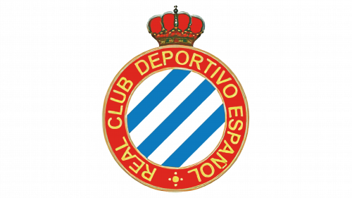
The new logo was created for RCD Español in 1912: the lettering is removed from the body of the badge, and now the full wordmark is written in yellow around the red frame’s perimeter. Another new thing on the logo is a red ornate crown, placed on top of the circle.
1923 — 1931
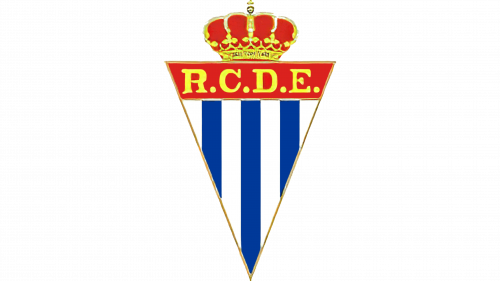
An experimental version of the badge was introduced in 1923 — the circle was replaced by a triangle pointing down. The “R. C. D. E.” Lettering is yellow was placed on a red wide line on the top of the badge, with a red and yellow crown above it.
1931 — 1934
The circular badge comes back in 1931, but the crown is being removed from the official logo. The lettering around the emblem’s perimeter now features a bolder and more confident sans-serif typeface.
1934 — 1940
In 1934 the crown is put on the circle again, but now it is composed of a stonewall with four square towers. The circular part of the badge remains unchanged.
1940 — 1995
The logo is being refined again in 1940. The crown is replaced by a more elegant and classy one, and the contours of the rounded badge are being cleaned and modified. Now the whole emblem looks more balanced.
1995 — 2005
The redesign if 1995 brings bold lines and bright colors to the club’s visual identity. All the outlines are gone, just thick sleek lines. The composition of the logo remains the same, everything is just a bit enlarged and looks vivid and fun.
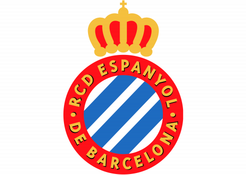
2005 — Today
The logo gains a more professional and strong look in 2005. The colors become a bit darker and calmer and the lettering now has a thin shadow, which adds volume to the image.
Espanyol Colors
WHITE
PANTONE: P 1-1 C
HEX COLOR: #FFFFFF;
RGB: (255,255,255)
CMYK: (0,0,0,0)
BLUE
PANTONE: PROCESS BLUE C
HEX COLOR: #007FC8;
RGB: (0, 127, 200)
CMYK: (100, 37, 0, 22)
RED
PANTONE: 485 XGC
HEX COLOR: #DF1116;
RGB: (223, 17, 22)
CMYK: (0, 92, 90, 13)
YELLOW
PANTONE: 109 CP
HEX COLOR: #F4CF0C;
RGB: (244, 207, 12)
CMYK: (0, 15, 95, 4))


