Grupo Elektra is a financial and retailing corporation serving Mexico, Central America, and South America. It has its headquarters in Mexico City, Mexico, and the United States. The brand is known as the largest non-bank provider of cash advance services in the US.
Meaning and history
The company was established in 1950. While the Grupo Elektra logo has gone through more than one update, it has been pretty consistent in its palette and the main symbol, the sun.
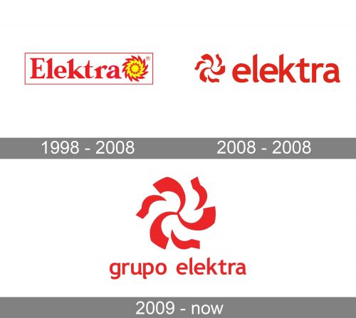
1998 – 2008
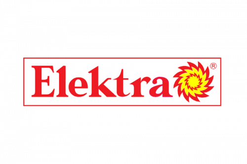
The oldest logo on the list showcases the sun (or “Sol Elekrta,” as the company calls it) in yellow with a bright red trim and a red circle inside. The shape of the rays makes it look like a swirling liquid, which adds a lot of dynamism to the design.
To the left of the emblem, the name of the brand can be seen in a rather traditional serif type. The letters may look rather plump, but at some points, the glyphs are pretty thin. Such a contrast is more characteristic of older typefaces.
2008 – 2008
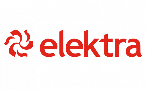
The design has been simplified, to bring it closer to the modern standards of logo design. For instance, the serif type has been replaced by a sans serif one, which looks cleaner. And yet, it doesn’t mean that it has become more generic. Quite the opposite – the letters are recognizable due to the multiple unusual details (for instance, the shortened ends of the “a” and the “e’s.”
The emblem has grown cleaner, too. The yellow patches have disappeared, while the number of red strokes has diminished.
Also, the shade of red has grown darker, which provides a more pronounced contrast.
2009 – present
The primary logo of the Grupo Elektra is dominated by the “Sol” (sun) symbol. It looks pretty much like on the emblem described above, but is flat (without the darker patches on some of the strokes).
Below the emblem, the lettering “Grupo Elekra” can be seen. It features the same typeface as in the previous version, but the shade of red is slightly more vivid.
Font
The type looks unique without sacrificing its minimalism and perfect legibility. Some of the most notable glyphs, apart from the “e’s” and the “a,” are the “p” with its unusual curve and the “l.”
Colors
The Grupo Elektra logo has always had red as its primary or even the only color. This made the design look energetic and eye-catching, which only reinforces the emotions conjured up by the “Sol” emblem.


