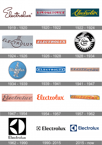
Electrolux appeared in 1919 as the result of the merger of Lux AB and Svenska Elektron AB. For the first half a century of its existence, the company used script logos resembling handwriting.
Meaning and history
The Electrolux visual identity history is not very intense and bright, as its current logo was designed at the beginning of the 1960s, and became iconic and recognizable in no time, so there was no need for the brand to invent something new, and by today the emblem was only slightly refined and that is it.
The original logo for Electrolux was created in 1901 and stayed with the company for almost twenty years. It was a bold circular badge with a black background and white drawings on it. The graphical part of the emblem consisted of a globe patter on the upper parts and a sharp white star placed in the center and separating the upper part of the circle from the bottom one, which was colored black. The “Lux” wordmark in black cursive letters was placed over the white star and had its “X”s tail elongated and underlining the whole nameplate.
1919 – 1920
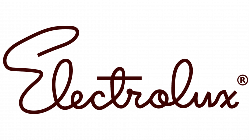
The very first logo was a dark brown wordmark of the brand, written in a cursive handwriting with a lot of loose twists.
1920 – 1922
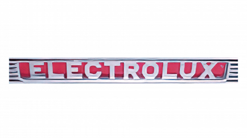
In 1920, they opted instead for a collection of metallic-looking, capital sans-serif characters, usually placed in front of red rectangular background.
1922 – 1924
The 1922 design was also a cursive writing, but more uniform this time. It used yellow, tilted letters placed on the dark blue background.
1924 – 1926
This logo uses a curved sans-serif writing running through a narrow ring set behind the word’s center. This figure is also crowned above by three vertical lines. The color was usually brown.
1926 – 1928
The next emblem uses a red rectangle with a white writing made in capital letters. These are tilted, bold serif letters.
1928 – 1934
This design is more elaborate: a black-and-white circle divided in two sections by a circle in the middle. This circle held the brand’s name, written in two lines of cursive, elegant writing. The bottom half of the emblem was black, but filled with rays protruding from the circle in the middle. The upper half was a portion of the world’s map with the continents and the latitude-longitude grid.
1934 – 1939
Their following emblem was a blue circle with two white elements in the middle, including an outline of a man walking with a toolbox in hand, and the company’s name made from cursive letters.
1939 – 1941
Next up, they adopted a blue rectangle with the white writing in its middle. The writing used bold serif letters (all capital) and was further outlined by a white frame.
1941 – 1947
The 1941 wordmark consisted of thin blue letters. They were somewhat cursive, but the main feature was that they were very linear and joined together by a single line in the base of the word.
1947 – 1954
The 1947 logo is also a cursive wordmark, except more regular and with tilted brown letters.
1954 – 1957
For the 1954 logo, they took one of the previous cursive wordmarks they used (the one from the blue round emblem), straightened it out and colored the thing red.
1957 – 1962
It’s the same writing, except more linear, tilted and with a shared line in the bottom, like in the 1941 design.
1919 – 1962
The redesign simplified the visual identity concept of the brand and introduced a new logotype, written in a smooth and elegant typeface with softened angles and curved lines. The color palette still featured a combination of black and white and looked sophisticated and timeless. The name of the brand was split into two parts with “E” and “L” capitalized.
1962 – 1990
In 1962 the company adopts a new symbol for its visual identity and it becomes an inevitable and essential part of the brand for all the following years. The new logo was composed of a bold black square with a white circle placed inside. In the circle, there was a black stylized image of a three-pointed star, which looked elegant yet progressive and chic. The nameplate in white was written over a horizontally stretched black rectangle and placed under the emblem. The inscription was now set as one word and was executed in a traditional serif typeface, with only the first “El capitalized.
1990 – 2015
In 1990 the colors of the wordmark got reversed and now it was black lettering on a white background color which was placed on the right from the emblem. As for the emblem, it remained the same, just became smaller to put more accent on the nameplate.
2011 – 2015
The emblem becomes the main hero of the Electrolux visual identity in 2011. It is being enlarged, while the wordmark is now written in a smaller size of a classy and timeless serif typeface with distinct and sharp ends of the lines. The monochrome color palette, which was in use by the brand since the very beginning, worlds greatest for the abstract geometric composition of its icon and traditional lines of the inscription.
2015 – Today
The redesign of 2015 brought a new typeface to the Electrolux visual identity, replacing the chic and elegant serif font with a modern and custom sans-serif. The new typeface had rounded angles of the letters and looks stylish and progressive, showing the evolution of the brand and its willingness and ability to grow and change.
Color of the emblem
The dark, rich shade of blue featured on the logo goes with the code 282 in the Pantone Matching System.
Font
The typeface featured both on the Electrolux logo itself, as well as the company’s other visual communications, is a custom font called Electrolux Sans. It exists in the three versions: Semibold, Regular, and Light.


