BNP Paribas is one of the largest French banks, which was established in 2000, but its history traces back to 1848. The company has its subsidiaries in more than 75 countries across the globe and is highly respected worldwide.
Meaning and history
Being in the top15 of the world’s leading banking groups, BNP Paribas features a bright and instantly recognizable visual identity.
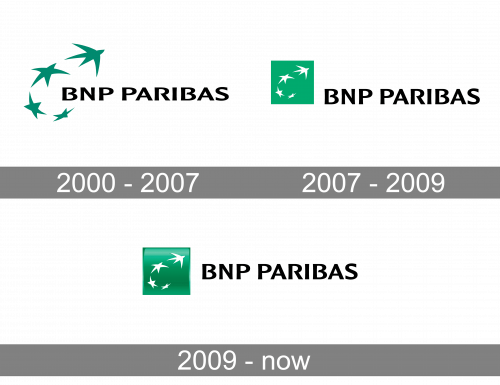
2000 – 2007
The BNP Paribas logo was designed in 2000 after the merger of two companies, BNP and Paribas. The logo is composed of a wordmark and an emblem on its left.
2007 – 2009
The “star birds” from the original logo have been placed into a green square. While in the previous version, the birds are larger and “fly” above the lettering, here, they have grown smaller and moved to the left of it. The type has remained unchanged.
2009 – Today
The black wordmark in all capital letters is executed in a custom typeface with strong and smooth lines, where the letters “B” and “R” are opened. It is a stylish and modern inscription, which is balanced by the strict shape of the emblem.
The BNP Paribas emblem is a bright green square with four flying stars, drawn in white. It is a symbol of the company’s background — the European Union. It also reflects the dynamic and progressive character of the bank and its individual approach to its clientele.
On the earlier versions of the BNP Paribas logo, there was a bright red underline, which symbolizes passion and energy. But the last redesign brought the company to simplicity and minimalism, which looks sleek and stylish, evoking a sense of power and expertise.


