Eastern Airways is a prominent airline operating today. The company specializes in regional flights, connecting various destinations across the globe. It is owned by Bristow Group, a renowned global provider of industrial aviation services. Eastern Airways operates from numerous airports, offering its services to both business and leisure travelers. With its commitment to safety and customer satisfaction, Eastern Airways continues to establish itself as a reliable and trusted airline in the industry.
Meaning and history
Eastern Airways is a British regional airline founded by Bryan Huxford in 1997. Over the years, it has achieved significant milestones in the aviation industry. The airline has built a reputation for providing reliable and efficient services to various destinations within the United Kingdom and Europe. With a focus on serving regional airports, Eastern Airways has become a preferred choice for business and leisure travelers seeking convenient connections. Currently, the company continues to operate a strong network of routes, delivering excellent customer service and maintaining its position as a prominent regional airline in the United Kingdom.
What is Eastern Airways?
Eastern Airways is a regional airline based in the United Kingdom. It operates scheduled domestic and international flights, primarily serving smaller airports and offering connectivity to major cities. With a focus on providing reliable and convenient services, Eastern Airways caters to both business and leisure travelers in the region.
1981 – 199?
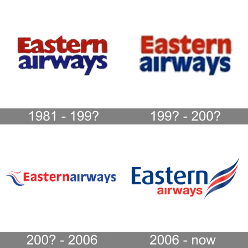
The logo of Eastern Airways from the 1980s featured bold two-leveled lettering in red and blue, with the top line set in the title case, and the bottom one — in the lowercase: the inscription, written against a transparent background, was executed in a heavy and elegant sans-serif typeface with full-shaped characters.
199? – 200?
The redesign of the 1990s has cleaned up the contours of the characters on the Eastern Airways logo, making the letter look more distinctive and confident, and slightly narrowing them. As for the color palette and the overall composition — it all remained the same.
200? – 2006
At the beginning of the 2000s, the logo was redesigned again, keeping the red and blue color palette, but brightening up both shades. The new badge was composed of a delicate and elegant emblem, formed by wavy red and blue lines, and two-colored lettering, written in one line with no space between the parts.
2006 – now
The redesign of 2006 has introduced a new version of the Eastern Airways logo. Now the lettering is set in two levels, with the top one written in blue, and the bottom one, using smaller characters, — in red. The inscription is followed by a graphical element, composed of two blue and one red lines, making up a smooth waving flag.


