Eastern Air Lines is a renowned airline specializing in passenger and cargo transportation. Under new ownership, it has reestablished itself as a prominent player in the aviation industry. With a diverse fleet and a commitment to exceptional service, Eastern Air Lines operates domestic and international flights to various destinations, catering to both business and leisure travelers. The company has established partnerships with leading airlines and operates from major airports, providing convenient connections and seamless travel experiences.
Meaning and history
Eastern Air Lines is an American airline that was originally founded in 1926. After going through various changes and mergers, the airline ceased operations in 1991. However, it was revived in 2015 as a new company, focused on providing high-quality air travel services. Eastern Air Lines operates scheduled passenger flights to destinations in the Americas and the Caribbean. The airline emphasizes customer satisfaction, offering a comfortable and enjoyable flying experience. With a modern fleet of aircraft and a commitment to safety and reliability, Eastern Air Lines aims to meet the needs of both leisure and business travelers. The company’s revival has brought back the iconic Eastern brand, known for its distinctive logo and livery, and seeks to build on its legacy of quality service and aviation expertise.
What is Eastern Air Lines?
Eastern Air Lines is a historic airline that was originally founded in 1926 and operated until 1991. It was one of the major airlines in the United States, known for its distinctive branding and iconic logo featuring a stylized Eastern “Hockey Stick” design. In recent years, a new iteration of Eastern Air Lines has emerged as a regional carrier in the United States, operating flights to various destinations.
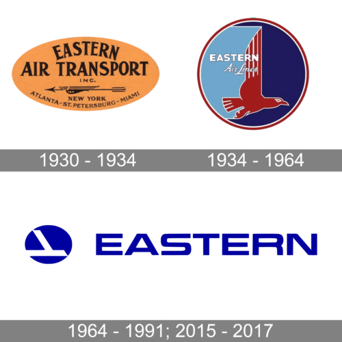
1930 – 1934
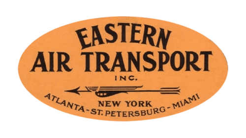
As Eastern Airlines was established in the early 1930s, its initial badge looked very adequate to its times. It was a horizontally-stretched orange oval with black lettering on it. The main wordmark was underlined by an elegantly stylized arrow pointing to the left. All elements on the orange badge were set in black, making up a very balanced and elegant composition.
1934 – 1964
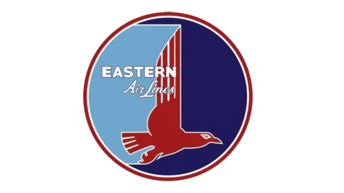
The redesign of 1934 has created a completely different image, with the main shape switched to a circle, and the color palette to two shades of blue, with red and white. The roundel was set in two shades of blue, separated by an image of a red eagle in a white outline. The name of the air carrier was written in two lines, overlapping the top part of the bird’s wing, and executed in two different styles.
1964 – 1991; 2015 – 2017
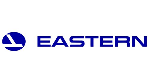
The third version of Eastern Airlines’ visual identity was the most minimalistic one. The badge featured a combination of an abstract emblem, with the solid blue roundel cut-out by two geometric white lines, making up an airplane tail. The emblem was set on the left from the enlarged and extended “Eastern” wordmark in the uppercase of a geometric sans-serif typeface, set in the same shade of blue as the emblem.


