DoubleClick is an internet advertising company, which was created in 1996 and bought by Google in 2007. The company is mostly known for the development of ad services for the world’s largest corporations.
Meaning and history
The DoubleClick visual identity looks laconic and professional. Using the green as the main color of the brand’s palette, the logo is fresh and recognizable.
The DoubleClick logo is composed of an emblem and a wordmark with a tagline on its right. The emblem features an image of two intertwined circles of two different shades of green. They resemble the infinity symbol and represent natural energy and progress.
The wordmark in thin sans-serif typeface looks neat and light. In classic gray color, it evokes a sense of authority and reliability. The “by Google” tagline in the smaller size of the lettering uses a lighter shade of gray and balances the two shades of green in the emblem.
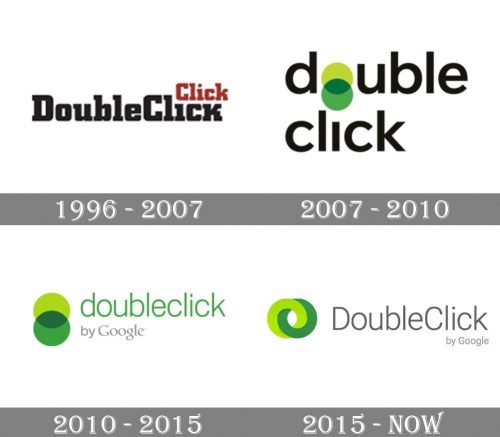
1996 — 2007

The brand was launched with a rather simple logo. It featured the lettering “DoubleClick” in a heavy serif type. The letters were based on the square with rounded corners.
Above the black word “click” in the name, the same word was repeated in smaller brown glyphs. This was a visual representation of the name.
2007 — 2010

The type became lighter and lost its serifs. All the glyphs were lowercase. The “double” idea was still reflected in this version but in a simpler way: there were two circles replacing the letter “o.”
2010 — 2015

The two circles were moved out of the wordmark and placed to the left of it. The font grew even lighter, and the lettering “by Google” appeared.
2015 — Today
The DoubleClick logo is simple and modest yet reflects the company’s values of innovations and its professionalism and authority.
Being a Google product, DoubleClick has a visual identity that accents more on the advantages of the brand, than on its design and this is what makes the company one of the market’s leaders.


