Dorothy Perkins is a multinational women’s fashion retailer with more than 110 years of history. It is based in the United Kingdom. Dorothy Perkins belongs to the Arcadia Group.
Meaning and history
Dorothy Perkins is a British fashion brand with a long history. Established at the beginning of the 20th century, today the chain consists of 634 stores in England and 129 outside and is owned by Arcadia Holding, which also owns Burton, Evans, Wallis, and other brands.
Dorothy Perkins is a British company producing collections of women’s clothing, shoes, and accessories, which are very popular due to the affordable prices and elegant silhouettes.
The Dorothy Perkins brand successfully combines fashion trends with classic views of fashion. The manufacturer offers clothes and shoes for every taste and occasion.Dorothy Perkins is focused on women aged 25-45, independent, stylish, and with an individual sense of taste.
What is Dorothy Perkins?
Dorothy Perkins is a British fashion brand, engaged in the production of clothes and accessories for women. Founded in 1909, today the brand has its stores in various countries, offering collections for women with no standard parameters.
1980 – 1991
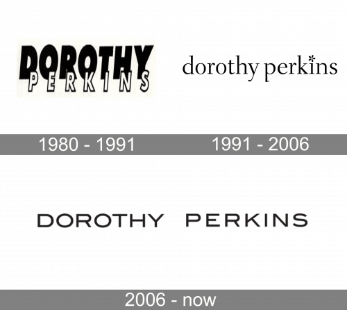
The logo, used by the British fashion brand in the 1980s featured a bold composition, with the white contoured “Perkins” in the uppercase of a traditional sans-serif font with straight cuts of the lines, overlapping an enlarged black “Dorothy” written in massive geometric sans-serif characters.
1991 – 2006
The redesign of 1991 completely changed the concept of the Dorothy Perkins logo, writing the wordmark in the lowercase of an elegant serif font with rounded contours of the letters and straight cuts of the lines. The dot above the “I” was replaced by a small black flower, stylized as the “*” sign. The badge was set in black against a white background and looked very airy and sophisticated.
2006 – Today
Taking into consideration that quite a few products feature elaborate decorative elements, you can be surprised by the straightforwardness and absence of decoration in the Dorothy Perkins logo. It features a plain sans serif type with almost no unique features except the somewhat broader than average proportions.
Yet, we can say that this approach provides a couple of advantages. In addition to being easy to reproduce, it also looks well on items of any style, from utilitarian to evening dress. As a result, the Dorothy Perkins brand is not restricted by the borders of a single style but can experiment with a variety of styles and trends.
Font and Color
The lettering from the primary Dorothy Perkins badge is set in the uppercase of a stylish medium-weight sans-serif typeface with clean contours of the letters and a lot of air between the characters. The closest font to the one, used in this insignia is, probably, ITC Blair Pro Medium.
As for the color palette of the Dorothy Perkins visual identity, it is set in black-and-white, putting the brand on one list with many well-known luxurious players in the fashion industry. The black lines make the logo of the label look elegant and timeless, showing the company as a progressive and strong one.


