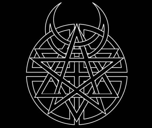
Probably the most known Disturbed logo is the one featured on the cover of the album Believe, which was released by the American alternative metal band in 2002.
Meaning and history
Most of the album covers feature the band’s mascot called The Guy. He is supposed to be the embodiment of the Archangel Gabriel the destroyer.
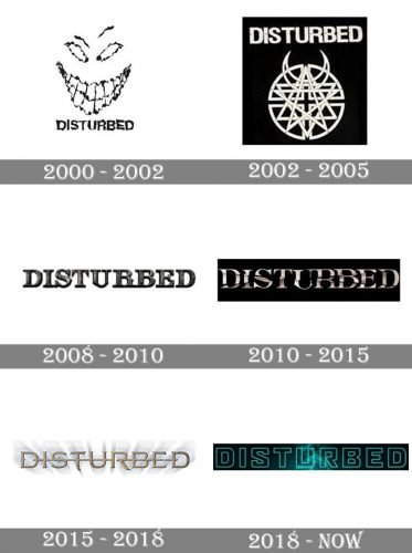
2000 — 2002

The first logo was created for the Disturbed in 2002 and featured a funny and at the same time scary smiley face in monochrome placed above the stylized inscription with the band’s name. The lines of the letters were slightly indecent and blurred which balanced the contours of the graphical part.
2002 — 2005
In 2002 the band redesigns its logo, making all the elements white and placing them on a black background. The smiley face got replaced by the star symbol enclosed into a circular frame with two devil horns resembling moons coming out of it. As for the lettering, it was now set above the symbol and featured a bold sans-serif typeface.
2008 — 2010

In 2008 the band starts using only the logotype, with no graphical additions. The first version created in this minimalist style was a dark gradient serif three/dimensional lettering with a metallic texture.
2010 — 2015
The redesign of 2010 makes the logo flat again, though the letter’s surface now resembles a mirror, and the lines of the wordmark are wavy, which looks very dynamic and artsy on a black background.
2015 — 2018
The logotype created for the band in 2015 looks elegant and stylish. The light gold shade of the letters with elongated lines is accompanied by a light gray shadow. A thin gold horizontal line is coming through the whole inscription, like connecting the symbols into a whole picture.
2018 — Today

The redesign of the 2018 bright futuristic shades and colors to the Disturbed logo. The bold outlined sans-serif lettering in white is placed on gradient background with black and turquoise shades. The contours of the letters are massive, though due to the thin white outline they look airy and fresh.
Emblem Disturbed
The Guy made his debut in The Sickness (2000). He did not have a real face, just a creepy smile and crazy eyes. On the cover of the Ten Thousand Fists (2005), the Guy was featured in a torn cloak with a hood and with chains on his body. On the cover of Indestructible, he was cloaked and on fire, in Asylum, he was chained up, while in The Vengeful One, he appeared as the Dark Messiah coming from the Heavens.
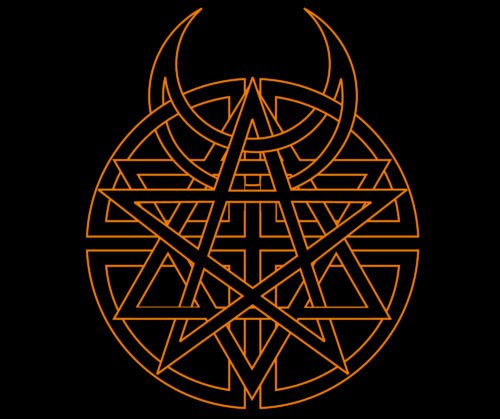
The Believe album symbol
On the cover of the album, four religious emblems are combined in a single logo. The emblems include the Jewish Star of David, the Christian Cross, the Pagan Pentacle, and the Muslim Crescent Moon. This logo symbolizes unity of religions.
Font
On each of the albums, a new type has been used. The types are not the same, but they have something in common: all of them are more or less clear and legible, especially if you compare them with the fonts typically used for other metal bands.
Color
On the cover of Believe, the band’s second studio album (2002), the logo is metallic grey, and a 3D effect is applied to it. The background is given in a rich shade of red. The name of the band is gold, while the name of the album is black.


