Delta Air Lines have gone through more than 20 different logotypes since they were founded in 1928. Many of the logos had one element in common: the triangle shape inspired by the name of the company (the Greek letter “Delta” is just a triangle) and the shape of a jet flying overhead.
Meaning and history
The date the airline was founded was May 30, 1924. The company was originally called Huff Daland Dusters and specialized in the manufacture and maintenance of military aircraft and in the use of aviation for agricultural pest control. Later, during the national crisis in the 1930s, it saved the company from bankruptcy when passenger transportation was not profitable. Having overcome difficult times, the airline began to actively develop aviation in all areas, offering more and more services.
In 1975, Delta Air Express, a cargo service that later became a founding member of the SwissCargo alliance, was founded. In the late 1980s, the company began its development in the markets of Europe and Asia, which later became one of the reasons for the founding of the largest international alliance SkyTeam.
Currently, Delta is among the top 3 largest airlines in the world by the following criteria: number of destinations (1st), fleet size (2nd), passenger traffic (3rd), number of passengers carried (2nd).
What Delta Air Lines?
Delta Air Lines is the name of an American airline that is one of the four founding members of the SkyTeam airline passenger alliance. Established in 1924, the company started its operations only five years after, in 1929. Delta Air Lines is headquartered in Atlanta, Georgia, has a fleet of 798 aircraft, and operates flights in more than 320 locations across the globe.
1925 – 1928
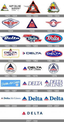
The history of Deta Airlines began in 1924 when it was established as a branch that specialized in the design of military aircraft of the airline giant Huff Daland. So the very first logo was based on the original name and field of activities of the company. It was a colorful triangular logo with lots of bright details in the image. The Greek god in a gold helmet was breathing steam on the Earth, that’s what the main plot was about. The triangle was set on the left from the black wordmark, written in three levels in a fancy and modern serif typeface.
1928 – 1930
In 1928 the company had already changed its profile: from a designer and manufacturer it gradually transformed into a full-fledged carrier. At the same time, a new logo was created. The new badge was executed in a red, black, and white color palette, keeping the triangular “delta” shape and the image of the Greek god as the basis. Now on the thick black triangular frame of the logo the three white words “Speed Safety Comfort” were written in the uppercase, and it said everything about the purpose of the company. Even though the motto was enough, it was not the only element of the new badge. Inside the triangle there was a white and black portrait for a god in a winged helmet, facing to the right and set above the rounded banner with the logotype.
1930 – 1934
After the first flight, which Delta was made in 1929, another logo redesign was held. The very first triangular logo was brought back, but the lettering was changed to “Delta Air Corporation Monroe, LA”, and was now set in all capitals of a simple sans-serif typeface around the frame of the graphical part. Simple, clean, and confident, that’s how the Delta badge from the 1930s looked like.
1934 – 1951
A modern and fresh logo was designed for Delta Airlines in 1934. The new concept was built around the triangular Delta symbol and a blue and red color palette, complemented by a lot of white elements, which added lightness and a sense of freedom. The new badge was composed of a red outlined triangle with stylized wings, formed by four horizontal lines with diagonal cuts each, spread straight to the issues. The winged delta was enclosed into a bold blue circular frame with the whole lettering written around its perimeter.
1934
A few months later another version of the badge was introduced: the logo was set on a white background and enclosed in a blue rhomboid frame, which was stretched horizontally and had its corners rounded. The logo featured some more additional lettering in dark blue; which elevated the professional aspect of the design and added Al reliability and confidence to the characteristics of the brand. Though this version of the logo was used for less than a year.
1935
The “Safety” part of the morrow from the logo of 1928 was replaced by “Convenience” for the badge, designed in 1935. It was a solid geometric badge with a red triangle inscribed into a bigger blue triangle, and having another small winged triangle as the main decorative element. The “Speed Comfort Convenience” was written in white sans-serif letters on the exterior blue parts, while the central red element was taken by the “Delta Airlines” logotype in all capitals of a modest and clean typeface.
1945 – 1953
In 1945 the badge became smoother and more elegant, with the stylized slanted logotype in white placed on a horizontally stretched ellipsoid banner in solid blue. The letter “D”, which was the only capital in the wordmark, had its upper part elongated to the left and stylized as a wing with three thin feathers, curved up at their ends. The “Air Lines” tagline was set in the upper face of a smooth modern sans-serif, balancing the softness of the main inscription.
1953 – 1955
The red color appeared on the Delta badge again after the redesign of 1953. The ellipsoid badge was now outlined in red and white and got two rectangular elements in red added to the frame from the upper left and bottom right corners of the logo. The upper banner had a white “Serving the Heart of an America” italicized sans-serif inscription on it, with the bottom was saying “And the Caribbean”. As for the main body of the badge, it was also changed, with the “Air Lines” replaced by an enlarged “C&S” in massive white letters.
1955 – 1959
The redesign of 1955 made the logo all smooth again. This time the internal ellipsoid featured scarlet red color when the wide framing was colored in light blue. The “Nothing Faster – Nothing Finer” motto was written in all capitals along the upper part of the frame, while the bottom part featured “To and Through the South” in the same style. As for the central part, it has the elegant “Delta” with the winged “D” on it, set above the white banner with the light blue “Air Lines” on it.
1959
The main logo of the company, introduced in 1959, had the iconic triangle placed horizontally, with its blue peak facing to the right. It was set on the left from the deep blue logotype, which only contained “Delta”, written in the uppercase of a stable and brutal sans-serif typeface with wide contour as of the letters and thick bars. This badge stayed in use by the air carrier for a bit more than two years.
1959 – 1962
The iconic triangular blue white and red emblem we all can see today first appeared on the Delta badge in 1959. There were two emblems created in the same year, and one of them was for the VIP service. It was a bold yellow frame with two sharp triangular elements on top and bottom. Inside the frame — a bold and modern two-leveled “Delta Jet” inscription in smooth massive capitals, a blue-white and red triangle above it, and a thin red cursive “Royal Service” written on the sides from the “Jet”.
1962 – 1966
The redesign of 1962 gave us a new version of the Delta Airlines logo. It was like a mix of two previous versions, the one with the triangular emblem, and the one with the ellipsoid background. The bright blue badge was outlined in thin white and thick red, had a blue, white, and red delta triangle overlapping its top border, and a white bold sans-serif logotype written over its central part. The inscription was set in all capitals and underlined by the “Air Lines” in the same style and color, but a smaller size.
1963 – 1993
The sleek and chic emblem was introduced by the air carrier in 1963. It was an enlarged dark blue white and red Delta symbol placed above the two-lined logotype in the same shade of blue, on a plain white background, and enclosed into a calm-gold circular frame. The “adult” color palette, clean lines, and balanced geometry are what made the Delta Air Lines logo from the 1960s outstanding and timeless. Each and every element of the badge was executed and placed just perfectly. The logo stayed in use for almost thirty years. For a reason.
1966 – 1976

A simpler version of the logo was created for Delta in 1966. The emblem here was set on the left, executed in a bright color palette, which made the whole badge look more friendly but as well less interesting. As for the logotype, set on the right from the triangular emblem, it was written in black capitals, with the upper level significantly enlarged and emboldened.
1976
For the company’s anniversary, the new badge was designed in 1976. To celebrate the date, the emblem got its elements colored with the American flag pattern — the upper blue triangle got white five-pointed stars all over it, while the bottom red one now featured white vertical stripes. The emblem was set above the “With The People” tagline, a handwritten “1776 — 1976” datemark, and covered by an arched uppercase “Delta Air Lines” logotype in blue. The whole composition was enclosed into a distinct blue circular frame.
1985 – 1987
In 1985 the air carrier attempted Leto look easier and more friendly, and introduced a new badge, with the light sky-blue shade as the main color of the palette. It was a solid blue horizontally stretched rectangular banner with the white handwritten lettering set on it a bit diagonally, and a small solid white circle with the iconic triangular emblem, placed in the bottom right corner of the logo. The experiment didn’t last long, and the badge was redesigned already in 1987.
1987 – 1995
The new logo of the American air carrier was way closer to the badge we all can see today, than all the previous versions. It was a dark blue and red triangular emblem set on the left from the slightly slanted uppercase logotype in a fancy softened serif typeface. It was simple and clean, airy and elegant. The logo stayed in use for a bit less than eight years.
1993 – 1995
The redesign of 1993 just slightly enhanced the previous badge, by adding another level of the inscription to it. The “Air Lines” was now set under the triangular emblem in the same style and almost the same size as the upper level of the badge. Honestly, it didn’t look very balanced; and this is why only stayed in use for less than two years.
1995 – 2000
The emblem became a bit darker and the logotype — bolder and more confident in 1995. This is when the inscription was set in one horizontal line and set on the right from the triangular company’s signifier. The lettering was executed in a title case of a bold and smooth serif typeface, with the first word in dark blue, and two following — in a very light, almost gray shade.
2000 – 2004
The color palette was brightened up and elevated in 2000, as well as the logotype was shortened. Now it all looked more balanced and powerful than ever before. The blue and red Adele’s symbol is set on the left from an extra-bold serif logotype in the title case, featuring the same color as the upper part of the emblem, as the same size as the first letter, as the iconic triangle. The only thing about this version is the softened and flattened top part of the red element in the emblem.
2004 – 2007
The arched red part of the Delta symbol was redrawn geometrically again in 2004. All other elements remained untouched and stayed in their places, in their colors and sizes. A bright,’ professional yet very kind and welcoming badge, stayed with the air carrier for another three years.
2007 – Today
The company logo has changed several times. But in most of the versions, its main element has been a triangle in the form of the Greek letter “delta” with the addition of the company name. Since 2007, the logo contains a dark red triangle and a laconic Delta inscription on its right side. Previously, it also had the word Airlines, but it was decided to abolish it to simplify the icon and not to overload it.
Font and Color
 The clean geometric lettering from the primary Delta Air Lines logo is set in the uppercase of a modern and simple sans-serif typeface with the characters placed on a significant distance from each other. The closest fonts to the one, used in this insignia, are, probably, Rolphie 08 ExtraHeavy SC, Concord Medium, or HF HySans Bold.
 As for the color palette of the Delta Air Lines visual identity, it is based on a patriotic tricolor, composed of red, blue and white, which makes sense for the leading air carrier of its country. This scheme also stands for precision and excellence, and evokes a sense of confidence and reliability.
What is the logo of Delta Air Lines?
The sharp and stylish logo of Delta Air Lines is composed of a modern geometric emblem, formed by two three-dimensional red triangles, and blue uppercase lettering in a clean sans-serif font, with the capital characters, placed pretty far from each other.
What is Delta named after?
The Delta Air Lines air carrier is named bit after the letter of the Greek alphabet but after the Delta of the Mississippi River, located between Yahoo and Mississippi, and known for constant flooding.
Is Delta blue or red?
In terms of visual identity, Delta Air Lines is blue and red, with the emblem set in red, and the lettering in blue. As for the actual color of the air carrier, the Delta area in the airports is blue.
What is Delta’s tagline?
The American air carrier Delta Air Lines pays much attention to its values and philosophy, and reflects it in the brand’s motto, which is “Connect the World. Reflect on the World. Respect the World. Our purpose is beyond flight”.


