

![]() Dead by Daylight Logo PNG
Dead by Daylight Logo PNG
Dead by Daylight is an asymmetrical survival horror game where you can play as either a survivor or a madman. There are bonkers from different already existing universes (Freddy Krueger, Michael Myers, Nemesis from Resident Evil, etc.). The cake was developed in 2016 by the Canadian studio Behavior Interactive.
Meaning and history
![]()
Dead by Daylight is a horror game from Behavior Interactive, released in 2016. The uniqueness of this game is that over time it does not lose its popularity at all, as the developers are constantly adding some innovations.
Dead by Daylight is a third-person multiplayer action-horror game in which four survivors try to escape from one maniac. The mechanics of the game are designed in such a way that one player will have to escape from his stalker, and the one who plays as the crazy one will have to find and kill all four victims.
Levels are randomly generated, allowing players to experience the game differently every time. Locations include a variety of available objects, as well as an interactive environment that can be used to achieve a particular goal.
What is Dead by Daylight?
Dead by Daylight is the name of a multiplayer (4 versus 1 player) horror video game in which one player takes on the role of a demented man, while the other four play as survivors trying to escape capture, torture, and death. The game was released in 2016 for Windows and in 2017 for other platforms.
In terms of visual identity, Dead by Daylight is the game, that stands out in the list of its competitors. The logo, designed for it in the very beginning, hasn’t been changed now, just as x tended, with the wordmark added to it.
2016 – 2021
![]()
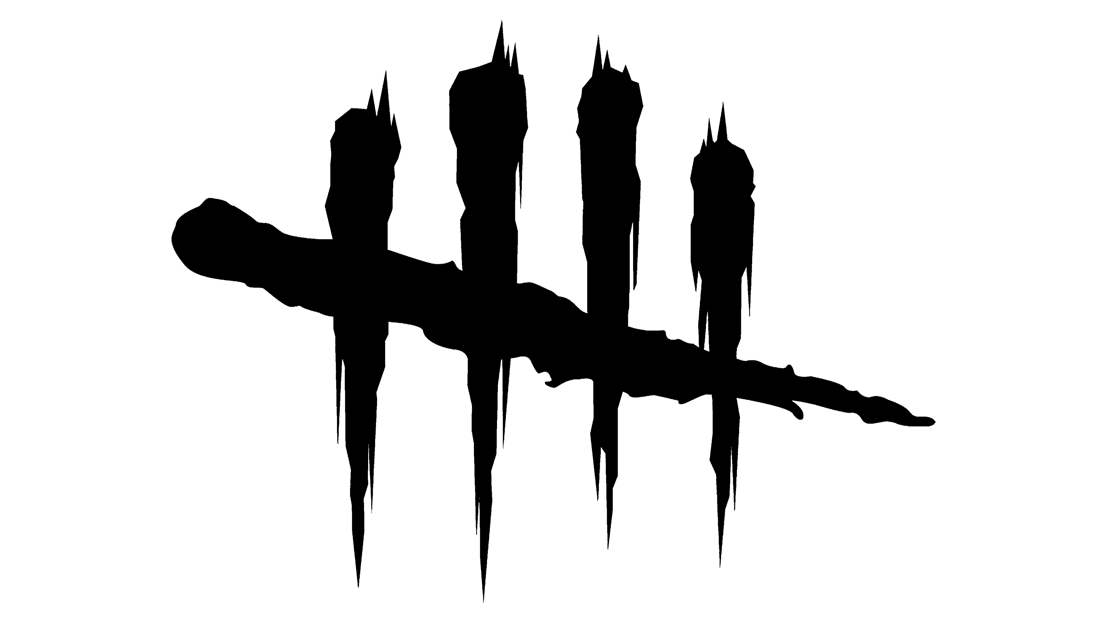
The original Dead by Daylight logo, designed in 2016, featured four stylized vertical blood strokes crossed by a diagonal one. This depicts the idea of the game — 4 players vs. one. Each of the strokes has its top point decorated by a human skull, which is turned in different directions from stroke to stroke. The spooky and creepy badge is, of course, set in black and white, which allows placing it on various backgrounds for a more dramatic effect.
2021 – Today
![]()
The redesign of 2021 has placed the Dead by Daylight emblem to the left of the enlarged lettering, with the white skulls almost unseen on the bold black strokes. As for the lettering, it is now the main hero of the logo, set in a modern yet strict and stable sans-serif font with small interesting details, which make it look unique and sharp.
Font and color
The heavy uppercase lettering from the primary logo of Dead by Daylight is set in a modern geometric sans-serif place with just a couple of designer details — some of the bars cut diagonally. The closest fonts to the one, used in this insignia, are, probably, Niva Small Caps Bold or Neue Kabel Pro ExtraBold, but with some minor modifications of the characters’ contours.
As for the color palette of the Dead by Daylight visual identity, it is based on the monochromatic combination of black and white, a symbol of masculinity, power, and, in this particular case — of danger and death.


