Davivienda is a financial organization from Columbia, which was established in 1972. Today one of the largest banks in its country, Davivienda is owned by Grupo Bolivar and specializes mainly in providing financial services to agricultural and rural segments.
Meaning and history
Davivienda is one of the very few banks in the world, featuring a very kind and cartoonish visual identity, which makes everyone feel a child reading a fairytale. Its iconic red house was adopted as the official emblem in 1972, in the year of the bank’s foundation, and since then it never left the Davivienda logo, pointing on the household, home, and warmth as the biggest values in everyone’s life.
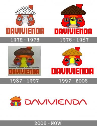
1972 – 1976
The very first logo of Davivienda featured an image or a red house with a white roof and smooth arched walls. In the middle of the house, there was a white arched door drawn, surrounded by two small white and gray windows on both sides. The wordmark in all capitals was placed under the image, executed in a bold geometric sans-serif typeface in the same shade of red.
1976 – 1987
The redesign of 1976 brought a new color palette — red became brighter, while white and gray elements got replaced by yellow and sea-blue. As for the lettering, it kept the original style and contours but gained a brighter red shade.
1987 – 1997
In 1987 the red house became three-dimensional. Its brown roof started looking as if it was made of chocolate, and all the other colorful details made the emblem look like a toy-house. The wordmark was still executed in the same bold sans-serif with straight cuts and arched vertical bars.
1997 – 2006
Ten years later, in 1997, the bank came back to the flat design, though decided to keep the color palette of the three-dimensional version.
2006 – Today
In 2006 the iconic house got a sleeker and more modern design by removing some of the small lines and details. Now the roof features a solid calm orange shade with no pattern, and the entrance of the house looks more professional and minimalist.
Another big change was made to the wordmark, which got a new typeface for the first time in the bank’s history.
Font and color
The Davivienda lettering in all capitals, placed under the emblem and drawn in red, boasts a very modern rounded sans-serif typeface, which has a futuristic style and reflects the company’s progress and energy. There are no horizontal bars in the letters “A”, and almost all the contours are arched and smooth, besides two “I”s, which also look friendly though.
The red, orange and yellow color palette of the Davivienda logo reflects warmth, passion, and love, and shows the importance of family and home.


