The history of the David Jones brand started in 1838. It was founded by a Welsh merchant David Jones and a Hobart businessman Charles Appleton.
Meaning and history
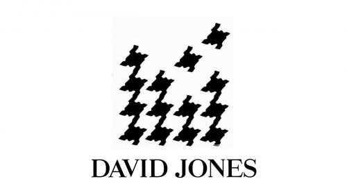
The old David Jones logo featured the name of the brand together with the signature black-on-white houndstooth pattern adopted in 1967.
The 2016 symbol
On July 25, 2016, the brand unveiled a completely new logo. Not only was the font style revised, but the references to the houndstooth were removed.
The emblem featuring a transitional serif type was criticized for the poor kerning, which was especially noticeable in “DA” and “ES.” In addition to the primary logo, which was given in a single line, there was also a stacked version. Here, the words melded together. From the one hand, this added a unique touch, while from the other, slightly damaged legibility.
Current emblem
By early 2017, the logo went through another update. It coincided with the expansion of David Jones into New Zealand as well as the beginning of the spring/summer campaign. This time, it was a pretty subtle modification. As there was no official statement from the brand, the alteration went unnoticed by the majority of customers.
The most noticeable change is that there is now more breathing space between the letters. The serifs have grown somewhat longer. The ends of the serifs are now cut straight rather than rounded. If you take a closer look at the horizontal strokes positioned on the baseline or at cap height, you will notice they are straight and not curved like in the previous version. The overall proportions and contrast have stayed pretty much the same, though.
Font
There are quite a few fonts that are somewhat similar in style, although aren’t exactly the same. The list includes Aria Text G1 Regular published by Rui Abreu or Kostic Serif Medium published by Kostic Type Foundry, for instance.
Colors
The David Jones logo has been traditional in its palette: the black lettering on the white background.


