Dairy Queen is the name of the American fast-food chain, which was established in Illinois in 1940. By today the restaurant chain, which specialty is ice-cream, milkshakes, and common fast food things, such as hot dogs and French fries, has over four thousand spots across the country, and even more — worldwide.
Meaning and history
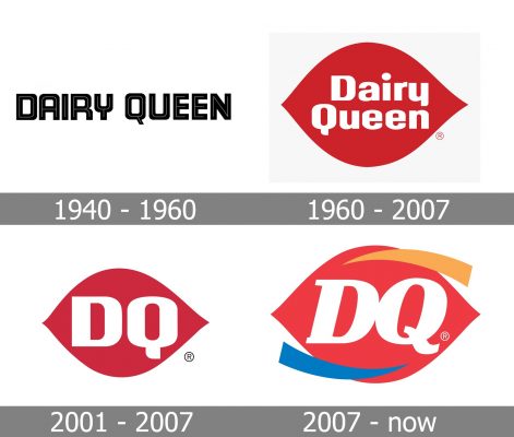
For the first twenty years of its existence, the famous fast-food chain has been using a simple black logotype as the only elements of its visual identity, and only in 1960, the brand found its special unique style, which still can be seen on the banners across the globe.
1940 – 1960
The original Dairy Queen logo was composed of a bold black inscription with thin white lines coming through each letter. The wordmark was executed in a custom sans-serif typeface with some of the angles rounded, and some — sharp. The logo looked modest yet had something strong and eye-catching in it.
1960 – 2007
The redesign of 1969 introduced a logo, which became a basis for all the following Dairy Queen redesigns. It was a white inscription set in two levels on a red beach ground, which looked like a smooth petal and aimed to symbolize kissing lips. The nameplate was written in the title-case of a strong and modern sans-serif typeface, resembling the one from the previous version.
2001 – 2007
In 2001 the lettering on the logo was shortened to just to “DQ” capitals, which were enlarged and written in smooth and bold sans-serifs with rounded angles and distinct cuts of the edges. The color palette was slightly changed, making the scarlet red color calmer and closer to pink. This logo was in active use for six years, but still can be seen in some of the restaurants.
2007 – Today
In 2007 the Dairy Queen visual identity gets another redesign. The lettering on the iconic lip-badge switched its typeface to an italicized serif one, and “D” gets glued to “Q”. The calm pink shade of the previous version is being replaced by a bright red, and two additional details appear on the emblem — an orange arched line on the upper part of the logo, and blue on the bottom.
Font and color
The “DQ” monogram from the official Dairy Queen badge is executed in an elegant and strong serif typeface, which is very similar to such fonts as New June Serif ExtraBold Italic and Trada Serif Black Italic but with the tail of the “Q” modified. The lowercase letters from the full wordmark version look closer to Bodrum Sans 19 Black Italic, with neat classy shapes.
The red and white color palette of the Dairy Queen visual identity represents the love and caress of the restaurant chain to its customers, accenting also on professionalism and loyalty of the company. And the additional orange and blue elements from the new brand’s badge elevate the look, adding energy and confidence and representing growth and high quality.


