D.C. United is the name of one of the strongest clubs in Major League Soccer, which was established in 1996 in Washington DC. One of the most successful football franchises in the United States in wined by DC United Holdings and has Ben Olsen as the head coach.
Meaning and history
The visual identity of the football club from Washington DC is all about power and strength. Its iconic symbol, a black eagle, has been with the team since the very beginning and was only slightly modified throughout the years. In the beginning, it looked a bit like a Nazi symbol but turned into something really stylish and remark-able.
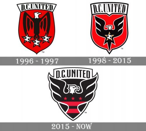
1996 — 1997
The original logo, introduced in 1997, was composed of a sleek crest with smooth sides and sharp angles. The main part of the crest was scarlet red, while the upper part with the wordmark was plain white. The black lettering in classy bold serif font perfectly balanced the black eagle with a white head, placed on a red background.
Under the eagle there were three white stars in a black outline, each of them featured an image of a football in the middle.
The black, red, and white color palette of the D. C. United visual identity reflected the courage and strength of the team, making the logo timeless and actual.
1998 — 2015
The composition of the badge remained the same, but all the contours and elements were redrawn in 1998. The shield became wider and its contours — bolder. The lettering on the white banner gained a new narrowed style, with longer and more elegant serifs.
As for the eagle, it turned its head to the left and was now outlined in white, which made the whole badge more distinct and clean. The stars under the bird were re-moved, but now another star appeared on the eagle’s body — it was yellow with a monochrome football on it.
2015 — Today
The redesign of 2015 made black the main color of the club’s official palette. The shield was all black now, as well as the sans-serif inscription in its upper part. The main hero of the logo, the eagle, turned its head again and is now looking to the right, like on the first version of the logo.
The eagle’s wings are enlarged and come out of the shield’s borders. As for the star, it is now replaced by two red horizontal stripes and three solid red stars, placed on the body of the bird.
The F. C. United logo is sleek and elegant, yet evokes a sense of danger and bru-tality, pointing on the team’s power and professionalism, and showing them as the strongest competitors.
D.C. United Colors
BLACK
PANTONE: PMS BLACK 6 C
HTML HEX COLOR: #241F20;
RGB: (45, 41, 38)
CMYK: (63, 62, 59, 94)
WHITE
HEX COLOR: #FFFFFF;
RGB: (255, 255, 255)
CMYK: (0, 0, 0, 0)
BLUE
PANTONE: PMS 298 C
HTML HEX COLOR: #41B6E6;
RGB: (65, 182, 230)
CMYK: (67, 2, 0, 0)
GOLD
PANTONE: PMS 142 C
HTML HEX COLOR: #F1BE48;
RGB: (241, 190, 72)
CMYK: (0, 24, 78, 0)


