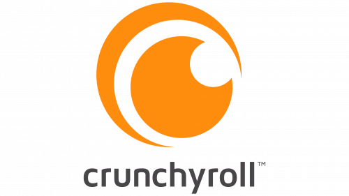
The meaning behind the logo of Crunchyroll, one of the world’s most popular anime streaming websites, might not be obvious from the start. And yet, it is right there, in the stare of the huge orange eye.
Meaning and history
The project went live in the spring of 2006 as a streaming site focused mainly on Japanese animation. It was only in 2009 that the website started to secure rights to host content lawfully.
What is Crunchyroll?
Crunchyroll is a streaming website focused mainly on anime, manga, and dorama.
2006 – 2012
The original Crunchyroll logo was way different from its geometric and symmetric successor, which is well-known for the majority of us. And yet, the visual metaphor behind the design was pretty much the same.
The logo was dominated by an orange, black, and white roundel, which symbolizes a human eye. It is, of course, depicted in a highly stylized manner, which makes it similar to the way things are drawn in anime.
The most prominent part of the emblem is an orange circle. It is not a perfectly symmetrical circle, but rather a shape based on it. While the edges are fairly smooth, you can still notice the asymmetrical parts with the naked eye.
Inside the orange circle, there is a black spot, also based on a circle, which represents the pupil of an eye. There are also two larger rings going around the orange circle, a white one and a black one, and also several smaller white and black shapes added for visual emphasis. The rings aren’t even either and look as if they have been drawn carelessly. That’s not to say it’s not deliberate, of course.
The wordmark shares the laid-back style of the emblem. And yet, although the letters are also written in a casual manner, they are still clearly legible. Their plump, rounded shape makes them similar to the emblem in the overall style. The fact that the lettering was black made it take second place to the bright circle.
2012 – 2018
The laid-back, casual, “drawn-by-hand” style was replaced by a sleeker geometric look. This time, there were real rings and circle shapes, nothing vague and uneven. The eye metaphor remained, though, creating a distinctive link with the previous logo.
The black elements in the “eye” were colored orange, so now only orange and white remained on the emblem. The text, however, was dark gray. It was pretty small, so once again, the emphasis was placed on the emblem rather than the typographic part of the logo.
2018 – 2024
The text was colored orange, like the emblem. As result, we now have a more homogeneous logo. Another notable update considered the shade of orange – it has grown more saturated, providing better contrast against the background than the previous version. It is essential to have an enhanced contrast now that the text is orange, so as to provide adequate legibility.
The number of anime shows on offer exceeds 1,000, and there are also over two hundred East Asian dramas, not to mention numerous manga titles.
2024 – Today
In 2024 the proportions of the CrunchyRoll logo were significantly changed. Now both elements are set in one horizontal line, with the emblem getting smaller, and the wordmark rewritten in the title case of a bold sans-serif typeface with more traditional shapes of the characters than on the previous logo. The short curved tails of both “L”s accent the “roll” part of the brand’s name and support the circular shape of the emblem.
Icon
The Crunchyroll Icon is fun and bright, though it uses only two colors — orange and white — for its palette, it is still eye-catching and memorable.
The icon is composed of a stylized letter “C”, looking like a moon, with a bite off in its upper-right part, outlines in white and orange elements. The letter is set on the bottom part of the white and orange circle, making the whole composition playful and irrational. This absence of the expected symmetry is what makes the icon truly unique and shows the character and values of the company better than anything else.
Colors and font
The typeface is seemingly simple. In spite of the classic proportions and legibility, the glyphs have various tiny details that make the font stand out.
The vividness of orange perfectly fits the youthful, energetic, and uplifting spirit of the brand. By the way, orange is the primary color of the brand’s mascot, Hime, who was originally a fan creation submitted to the Anime Industry-tans Contest. Also, orange might be viewed as a reference to Naruto, one of the best-loved series on the website.


