Meaning and history
While the logo of the Italian football club Crotone has been undoubtedly inspired by the coat of arms of its home city, it’s far from a replica. The FC Crotone logo reshapes the city symbol turning it into a unique and instantly identifiable football badge.
1986 – 1991
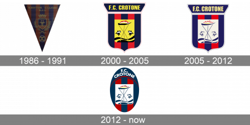
 One of the club’s earliest emblems is just a copy of the heraldic emblem of its home city. In 1986, this badge was replaced by a three-pointed pennant, where the city’s emblem was positioned above a football. The background featured blue and reddish stripes.
2000 – 2005
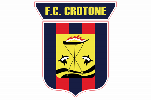
The main thing that was changed in the Crotone football club visual identity in 2000 was the shape of the logo. From the triangle, it turned to a square logo with a sharply pointed bottom and rounded angles. The lettering was placed on a wide horizontally stretched banner above the crest and was written in a bold sans-serif typeface, in bright yellow color. The central part of the badge featured the same shade of yellow for its background, balancing the lettering.
2005 – 2012
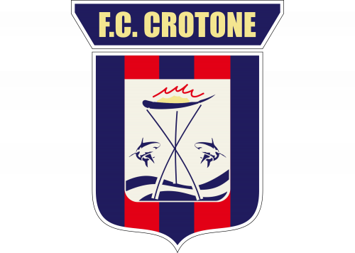
The redesign of 2005 worked a bit with the color palette of the badge, making the yellow elements look almost white, with the use of a very light and pale yellow shade. Another change was made to the inscription banner of the badge — the letters in the “Crotone FC” o its mark got bigger and taller, adding confidence and strength to the characteristics of the football club’s visual identity.
2012 – Today
 The current logo is just a modification of the one described above. This time, the overall shape of the emblem is an oval instead of the original shield, while the yellow fields and letters have been replaced by the white ones.
Colors
The red and blue stripes that have been a recurrent pattern on the club’s logo come from the players’ uniform. The colors of the shirts, in their turn, were borrowed from the crest of the city of Crotone.


