Correos is a state-owned postal services company in Spain. It traces its history as far back as 1716, when the Bourbons took over the throne and the post became a state service under the guidance of Philip V of Spain.
Meaning and history
The Correos logo is based on the post horn, which is one of the most popular symbols in logotypes of postal companies. Nevertheless, the designers who worked on it have managed to create a unique interpretation of this universal symbol.
What is Correos
Correos is the major provider of postal services in Spain. It is 100% state-owned. In the 20th century, the post worked under the name Dirección General de Correos y Telégrafos/Caja Postal before adopting its current name in 2002.
1909 – 1976
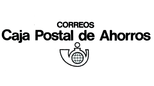
The very first badge was created for the Correos postal service in the beginning of the 20th century, and stayed with it for almost seventy years. It was a simple black-and-white composition with the bold sans-serif lettering in a traditional font, set above the contoured emblem. The emblem was drawn in thinner lines, than the characters, which put all accents on the name of the organization.
1977 – 1989
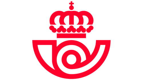
The redesign of 1977 has completely removed the text part from the official Correos badge, making the emblem from the original version the only hero of new concept. The drawing was enlarged and emboldened, and was now executed in thick white lines against a bright red background with no additional details. Due to interesting contours of the symbol and the bright color palette, the Correos badge looked very powerful and progressive.
1990 – 1999 (Correos y Telégrafos)
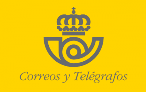
The design was tweaked without sacrificing its heritage. Once again, you could see the recognizable post horn symbol, but this time, the bright red color was replaced by a grayish shade of dark blue. The color of the background was also slightly modified. Instead of the clean and vivid hue of the previous logo, it became a bit darker and muted.
The lettering was now placed right below the emblem. It read “Correos y Telegraphos.” The glyphs were small and italicized. In all honesty, it was hardly an adequate choice. In comparison with the perfectly legible, minimalist letters seen in the previous version, this was a change for the worse.
2000 – 2010 (Correos)
The company made a step forward by introducing a more minimalist and legible visual identity. To begin with, the designers removed the yellow background in the primary logo. Also, the name of the brand grew larger and now dominated the design. You wouldn’t need a magnifying glass to see it even at small sizes.
The post horn emblem now played a smaller part and was moved to the upper left-hand corner of the design.
On the downside, the designers seemed to go overboard with decorative elements in the typeface.
2011 – 2019
Here, the type is already simpler and easier to grasp. Then again, it still has a unique touch due to the unusual link between the “C” and “o.”
The emblem now takes up far more space than in the previous version. The overall style appears more proportional.
2019 – present
The updated design is in line with the tendency for more minimalist logos. The circles in the crown were removed, while the strokes forming the crown became simpler, straighter. The wordmark disappeared from the primary logo altogether.
The new version was developed by Spanish branding agency Summa.
Colors and font
While the primary logo includes only blue elements, it is often placed over the yellow background in practical use, for instance when seen on Correos pillar boxes.
The type used by the company across various media is the result of the collective efforts of Summa and the Monotype type foundry. It was named Cartero, which means “postman” in translation from Spanish.


