Coppertone, a renowned name in the skincare sector, is primarily known for its line of sun-care products. Owned by Beiersdorf, this brand has etched its name as one of the leaders in sun protection, offering a range of sunscreens, tanning lotions, and after-sun products. With its roots deeply established in the United States, Coppertone has extended its reach globally, ensuring that people from different regions can shield their skin from harmful UV rays. The brand’s commitment to delivering top-quality sun protection solutions has made it a staple in households and vacation bags worldwide.
Meaning and history
Established in 1944 by pharmacist Benjamin Green, Coppertone began its journey to protect individuals from the scorching sun. Initially developed as a lotion to darken tans, its evolution has been significant. By the 1950s, Coppertone had gained notable recognition, especially with its iconic advertisement featuring a little girl and a playful dog tugging at her swimsuit. Over the years, the brand has pioneered various sun protection solutions, innovating with water-resistant and broad-spectrum sunscreens. Their commitment to research and development has cemented their position in the market. Fast forward to the present day, Coppertone stands tall under the umbrella of Beiersdorf, continuing its mission of offering high-quality sun-care products to global consumers.
What is Coppertone?
Coppertone is a distinguished skincare brand, primarily celebrated for its sun-care products. Originating in the United States in 1944, the brand has since expanded its reach globally. Owned by Beiersdorf, Coppertone offers a variety of sunscreens and tanning products, emphasizing quality and protection against harmful UV rays.
1944 – 1953
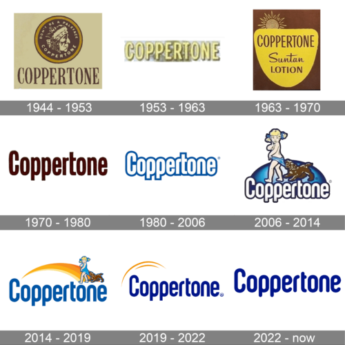
Imbued with a vintage charm, this Coppertone logo depicts a detailed illustration of a Native American profile. Encircled by the witty tagline, “Don’t be a paleface,” the design captures the essence of sun-kissed skin. The sepia-toned color palette adds to its nostalgic feel, evoking memories of sunny days past. Beneath, the brand name is boldly printed, solidifying its identity.
1953 – 1963
Glittering with a radiant golden sheen, this version of the Coppertone logo is undeniably captivating. The brand name, styled in embossed letters, shines brightly against its backdrop, reminiscent of the sun’s golden rays. The gradient effect, moving from a gleaming gold to a muted hue, subtly hints at the transformative power of the sun.
1963 – 1970
Evocative of classic beach vibes, this Coppertone design pairs a bold, yellow shield with a stylized sun, its rays spiraling outward. The words “Suntan Lotion” are gracefully inscribed below the brand name, suggesting protection and care. The contrast of the sunny yellow against the deep brown backdrop ensures the logo stands out, capturing attention.
1970 – 1980
This logo rendition exudes an old-school vibe with its maroon, textured font. The brand name is written in a cursive-like style, adding a touch of elegance and sophistication. The deep, rich color of the letters against the light background creates an eye-catching contrast, cementing the brand’s iconic status in the world of sun care.
1980 – 2006
This logo radiates simplicity and directness. The vivid blue hue is undeniably striking, ensuring the Coppertone name is instantly recognizable. Each letter is thick and bold, displaying strength and assurance. A subtle registered trademark symbol anchors the design, speaking to the brand’s established legacy in the skincare industry.
2006 – 2014
A delightful snapshot of summer is encapsulated in this logo. Featuring an animated young girl with sun-kissed cheeks and playful ponytails, she appears caught off guard as a spirited puppy tugs at her swimsuit. The scene is whimsically set atop a gradient blue emblem, and the iconic Coppertone name sits proudly below, balancing the playful nature with the brand’s authority.
2014 – 2019
Emanating warmth and protection, this logo artfully integrates a smooth sun arc, reminiscent of sunrises and sunsets. The vibrant golden curve juxtaposes the bold blue letters beautifully, suggesting the dual nature of sun exposure – both its joys and its challenges. The youthful girl and her mischievous puppy, familiar Coppertone mascots, add a touch of nostalgia and charm.
2019 – 2022
Clean lines and graceful curves define this Coppertone design. A soft golden arc sweeps above the brand name, alluding to the protective shield the brand offers against the sun’s rays. The deep blue typography is assertive yet elegant, ensuring clarity and brand recognition. The registered trademark symbol further emphasizes the brand’s esteemed position in the market.
2022 – now
The “Coppertone” logo exemplifies a classic yet vibrant essence. Rendered in a rich shade of cobalt blue, each letter stands out with clarity, emphasizing the brand’s strength and confidence. The typography is straightforward with rounded edges, denoting accessibility and friendliness. The consistent letter spacing suggests reliability, while the seamless transition from capitalized “C” to the lowercase letters adds a touch of modern sophistication. Overall, this design resonates with a timeless appeal, portraying Coppertone as a trustworthy and established brand in the world of skincare.


