Copa Airlines is a major airline based in Panama. It is owned by Copa Holdings and operates as a subsidiary of the group. The company primarily focuses on providing domestic and international air transportation services to various destinations in North, Central, and South America. Copa Airlines has its main hub at Tocumen International Airport in Panama City and serves as a key connecting carrier in the region. With its extensive route network, Copa Airlines plays a vital role in facilitating travel and promoting tourism across the Americas.
Meaning and history
Copa Airlines is a leading Latin American airline headquartered in Panama City. With a history spanning over seven decades, the airline has established itself as a reliable and customer-focused carrier. Copa Airlines operates an extensive network of routes, connecting passengers to over 80 destinations across the Americas. The airline’s modern fleet and state-of-the-art facilities ensure a comfortable and safe travel experience for its passengers. Copa Airlines is known for its exceptional service, punctuality, and dedication to customer satisfaction. It offers a range of amenities, including onboard entertainment, complimentary meals, and a frequent flyer program. As a member of the Star Alliance, Copa Airlines provides seamless connections to destinations worldwide through its extensive network of partner airlines. With its commitment to excellence, Copa Airlines continues to be a preferred choice for travelers in the region, providing efficient and convenient air travel options.
What is Copa Airlines?
Copa Airlines is a major airline based in Panama that provides both domestic and international flights. It is recognized as the flag carrier of Panama and operates an extensive network of routes throughout the Americas. With a focus on connecting passengers through its hub in Panama City, Copa Airlines offers a range of services and amenities to ensure a comfortable travel experience for its customers.
1947 – 1957
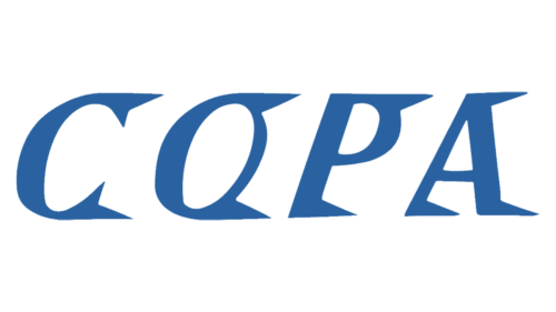
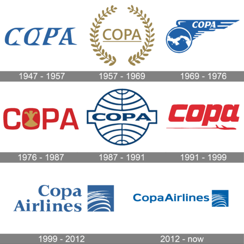
The original Copa Airlines logo, designed in 1947, featured an interesting stylized lettering in the uppercase, set in a medium shade of blue. The uniqueness of the inscription was in the triangular elements, which were decorating the right parts of each letter. As the characters were also a bit slanted, the whole composition evoked a sense of motion and freedom.
1957 – 1969

The redesign of 1957 introduced a more classy and traditional logo. It was a gold and white composition with an underlined uppercase wordmark enclosed between the two arches of a golden wreath. It was a very elegant and delicate image, which looked professional and chic. The logo stayed in use by the air carrier for a decade.
1969 – 1976
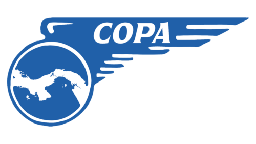
In 1969 the Copa Airlines badge was brought back to a blue and white color palette. The new composition was formed by a stylized blue globe in a white outline with a blue wing, stretched to the right. The name of the air carrier was written in bold white capitals on the blue wing.
1976 – 1987

The redesign of 1976 switched the style and the color palette of the Copa logo, and the new concept was based on a dark red uppercase lettering in a geometric sans-serif typeface, with the letter “O” decorated by a golden heraldic symbol in the negative space. This version of the badge stayed in use for longer than ten years.
1987 – 1991
In 1987 the logo of the air carrier became blue and white again. The bold uppercase wordmark was inscribed into a stylized globe with thin blue meridians all over. The central part was rectangular, making up a space for the inscription.
1991 – 1999
The redesign of 1991 rewrote the name of the air carrier in the lowercase of an extra-bold sans-serif typeface, in solid red. The inscription was underlined by a thin red trace of a small stylized plane, which was placed under the logotype, flying to the right. All elements were set in one shade, creating a strong balanced image.
1999 – 2012
The stylized globe came back to the Copa visual identity at the end of the 1990s. It was now drawn in white arched lines on a solid blue square, set on the right from the two-leveled inscription, set in the same shade of blue, using an extra-bold serif typeface with slightly extended contours of the characters.
2012 – now
The redesign of 2012 has rewritten the text part of the logo into one horizontal line, with the serif typeface replaced by a modern geometric sans-serif one. As for the emblem, it remained untouched.


