Conforama is one of the largest home furnishings retail chains in Europe. It is headquartered in Lognes, Seine-et-Marne, France, and has more than two hundred stores. In addition to France, you can find them in other countries of the European Union, from Spain, Switzerland, Portugal, Luxembourg, Italy, and Croatia, to name just a few.
Meaning and history
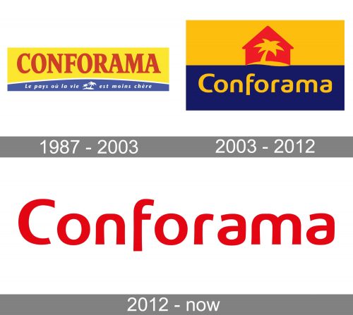
The evolution of the Conforama logo has included several steps bringing it from a slightly overloaded design to a contemporary minimalist one.
What is Conforama
Conforama is a French company specializing in furniture and home accessories, as well as household appliances. It has over 170 stores in France alone, not to mention the outlets in other parts of Europe.
1987 – 2003
The history of the brand started in 1960s, when several cofounders created the so-called Carrefour of furniture. In 1967, the first shop under the current name started working in Saint-Priest, Rhône.
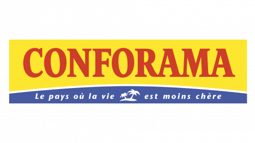
One of the oldest logos already included the combination of two horizontal fields, yellow and blue, which was also used in later versions.
Originally, the colors were vivid and eye-catching. The design heavily alluded to the “banana republic” or “sandy beach” theme. For one, the most obvious interpretation of the combination of gold and blue is the sand and the ocean. To hammer the point home, the designers used a tiny picture of an island with two palm trees.
All this supported the tagline, which read “Le pays où la vie est moins chère.” In translation from French, this phrase means “The country, where life is less expensive.” This is a poetic rendition of the company’s pricing policy known for its substantial discounts and the abundance of keenly priced items.
2003 – 2012
In the following version, this message was expressed in a veiled form. In fact, it was hardly possible to decipher it based on the Conforama logo alone.
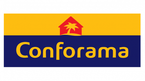
The combination of blue and yellow was still there, but the colors grew darker. The blue was very far from the color of the ocean, although the small wave in the middle still hinted at the marine theme. The red stylized house in the middle implied that the company had something to do with the interior, but no other hints were given. Instead, you could see a single palm tree in front of the house.
Such a design could be easily understood as the logo of a travel agency. Yet, as the company was already recognizable, even this approach probably couldn’t do much harm.
On a more positive note, the wordmark was a priceless gem. The streamlined type was unique and recognizable without sacrificing legibility. The use of the red color in the logo could be explained by the desire to preserve the coloristic scheme of the previous logo, thus saving at least some of the brand’s heritage and improving the recognizability of the updated design.
2012 – present
Only the wordmark was left. It still featured the sleek glyphs of the previous version, which made it memorable enough. The rounded elements echoed the marine theme of the older visual brand identity.
The wordmark alone is well enough for a modern logo, especially if it belongs to a company that is well-known in the local market.
Colors and font
The color of the 2012 logo can be described as orange or vermillion. Anyway, it is a strikingly vivid, optimistic, and energetic hue that catches your eye. Additionally, it is close to the red color used in the previous logo, so in a way, it represents the brand’s heritage.
The custom type is the highlight of the Conforama logo.


