 Coastal Carolina Chanticleers Logo PNG
Coastal Carolina Chanticleers is the name of an athletic program from Coastal Carolina University, which was established in 1954, and based in Conway, South Carolina. The program is composed of 20 men’s and women’s teams, which are all part of Division I of the National Collegiate Athletic Association.
Meaning and history
Apart from playing in the first division of the NCAA, the Coastal Carolina Chanticleers teams are members of the Sun Belt Conference, an organization, which was established in 1976, and is affiliated with Division I of the National Collegiate Athletic Association, with the football clubs playing in the special subdivision — FBS.
What are Coastal Carolina Chanticleers?
Coastal Carolina Chanticleers is a collegiate athletic program of Coastal Carolina University, which is composed of 9 men’s and 11 women’s teams, competing in various sports disciplines, including Basketball, indoor and outdoor Track&Field, Soccer, Football, Lacrosse, and others.
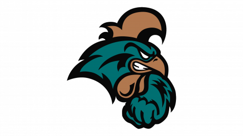
In terms of visual identity, the Coastal Carolina Chanticleers teams stand out in the list of their competitors but using not the most popular animal mascot — a rooster. Though on the logo of the athletic program of the Costal a Carolina University, the bird looks unexpectedly strong and evokes a sense of readiness to fight, and which is more important, to win.
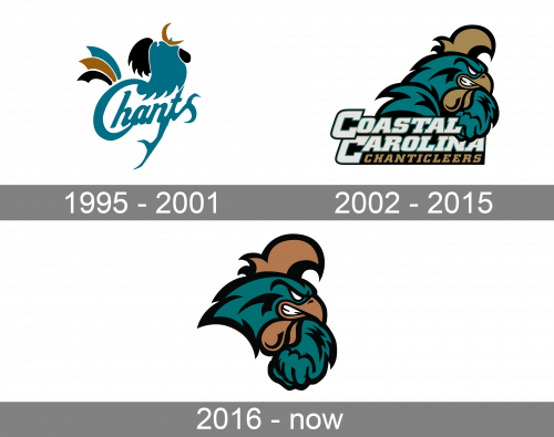
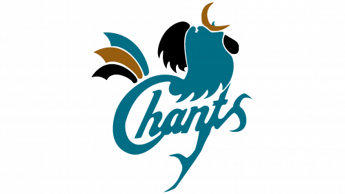
1995 – 2001
The Coastal Carolina Chanticleers logo, introduced in 1995, featured a cool and modern stylized image of a turquoise rooster with black and gold details on its head and tail. The bottom part of the rooster has its lines elongated, forming the first letter “C” of the “Chants” logotype, executed in the same shade of turquoise in a custom handwritten typeface. The vertical bar of the lowercase “T” was also elongated, but this time it was a straight diagonal line, forked at the bottom, and making up the legs of the bird.
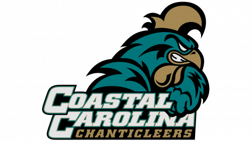
2002 – 2015
The redesign of 2002 showed the world the new image — a ferocious and ready-to-fight rooster was depicted in profile facing to the right, and drawn with an evil smile, that could be read from his half-open beak. The bird was drawn in dark turquoise, with the thick black outline of the main contour and numerous stylized feathers. The details were drawn in gold. As for the lettering part, it was set at the bottom of the logo, written in three levels, with the first two “Coastal Carolina” in bold light gray letters of a custom typeface with square cuts of the lines, and the gold “Chanticleers” in small capitals, written in a slanted square serif font along the bottom line of the badge.
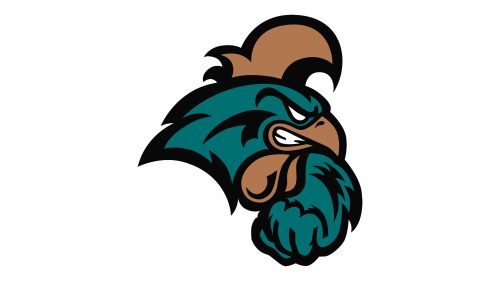
2016 – Today
In 2016 the Coastal Carolina Chanticleers badge was simplified to just one element — the rooster image, with the lettering being removed. The rooster was slightly refined, getting its color palette deeper and the black outline — wider. The extra feathers were also gone, so the whole badge looks cleaner and more professional now, brilliantly reflecting the mood and values of the athletic program.


