Citibanamex is Alt he name of the Mexican subsidiary of Citibank, which was founded in 1884 as Banamex and was acquired by Citibank in 2001. The financial organization has its operating offices all over Mexico, and several branches in the United States (mostly southwest states).
Meaning and history
The visual identity of the Mexican bank was redesigned with each change of the name, starting with Banco Nacional de Mexico in 1884, which has seen three different versions, the logo created for the new Banamex name in 1976, and finally, the CitiBanamex emblem, which was introduced in 2016 and stays unchanged by today.
1884 – 1959
The very first emblem for Banco Nacional de Mexico was created in 1884 and boasted a traditional rounded medallion in a double outline with an elegant monogram in the middle. The “BNM” lettering was executed in a smooth typeface with all ends of the letters curved. The logo was executed in a chocolate-brown and gold color palette, which represented stability, excellence, and luxury.
1959 – 1964
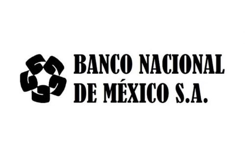
The redesign of 1959 brings a completely new emblem to the bank, and it will be in use for many years. The full lettering, executed in a bold serif font is placed on the right from the rounded emblem, also in monochrome. The emblem consists of a white ring coming trough five solid black squares with their sides arched. This was a representation of unity, togetherness, and reliability.
1964 – 1976
In 1964 the logo gained a new typeface, and all capital letters turned into an inscription in a title case, and the classy and thick serif typeface was changed to a modern sans-serif with bold rounded contours.
1976 – 1992
The name of the bank was changed to Banamex in 1976, so the new lettering was added to the logo. It was executed in the same typeface as the inscription from the previous version and had a tagline, containing the full name of the company.
1992 – 2001
The redesign of 1992 brought red color and simplified the visual identity of the Mexican bank. The emblem was now executed in red and white, while the lettering only contained an italicized “Banamex” title in a modified sans-serif.
2002 – 2016
In 2002 black color was replaced by a royal blue, and the typeface of the lettering was changed to a more traditional and rounded one. It was a neat and calm logo, which represented professionalism, responsibility, and loyalty to the financial institution.
2016 – Today
The bank changed its name to CitiBanamex in 2016, so the logotype now was written in the corporate custom typeface of Citibank, the new mother company, same was with the iconic red arch, an abstract umbrella, which symbolizes protection and trustworthiness. The Banamex ring emblem in red and white is now placed on the right from the lettering.
Font and color
The CitiBanamex logotype in calm blue color is written in the lowercase and executed in a modern yet elegant sans-serif typeface, which is very similar to Latinka Medium and as Scanno Semi Bold.
The blue and red color palette of the bank’s visual identity stands for power, progress, and reliability, along with togetherness and loyalty to the customers.


