Cirrus is a banking software, developed by MasterCard in 1982. The purpose of the program is linking the MasterCard credit and debit cards to ATMs across the globe.
Meaning and history
Cirrus is one of the most widely used international interbank software, which was developed in the middle of the 1980s. Today Cirrus is used by ATMs in 93 countries, some of which have even adopted Cirrus as a local and national interbank network. These countries are Sweden, Canada, the USA, Saudi Arabia, and India.
Payment system Cirrus is characterized by the very low cost of transfers between its members. The cards of this system are among the most inexpensive in service.
The great advantage of the global payment system is a low commission for money transfers between members of the network. Cirrus is also advantageous in that it provides low-cost maintenance of its cards.
The interbank payment system is owned by Cirrus System, Inc. Bank cards of this payment system can only be used to withdraw cash from ATMs marked Cirrus or Eurocard/Mastercard. Cirrus is a debit card, which cannot be used to pay online or for goods and services.
51% of shares of Cirrus System, Inc. belong to Mastercard International Corporation, which also promotes Mastercard payment system cards. Cards of the Cirrus payment system are practically not issued separately; they are usually used jointly with other banking products.
What is Cirrus?
Cirrus is the name of a global interbank payment system, which was developed by Cirrus System in 1986. Nowadays Cirrus network belongs to MasterCard Corporation and unites all types of cards of Diners Club International, Maestro, and MasterCard.
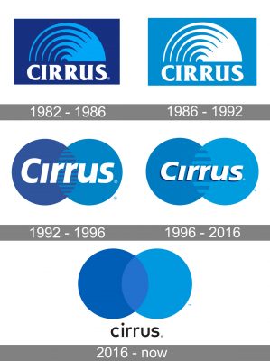
1982 – 1986
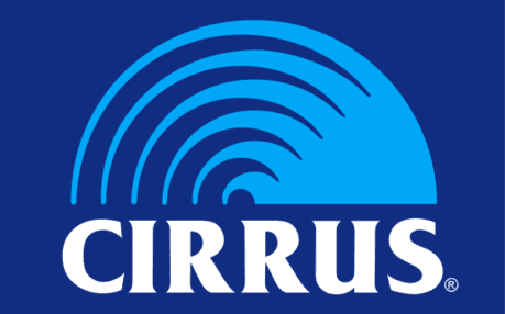
The original Cirrus logo already featured the circle theme and the blue palette characteristic of the current design. And yet, here, it wasn’t as minimalist and easy to grasp as it is now.
To begin with, there was only a semi-circle, and it had multiple sharp details. While this added some dynamism, it also cluttered the emblem. Also, there was a dark blue rectangle in the background. The type was bolder. It had serifs and strokes of varying thickness, which created even more noise.
1986 – 1992
The only notable difference was the shift to a lighter palette. The semi-circle grew white, while the rectangle grew light blue. Even this simple move made the design cleaner.
1992 – 1996
An emblem featuring two overlapping circles appeared. The wordmark was placed over them, which made the image more compact. The type grew cleaner.
However, there were still multiple sharp thorns in the area shared by the two circles.
1996 – 2016
The number of sharp thorns grew smaller resulting in a sleeker emblem. The word “Cirrus” became smaller, too. It adopted subtle dark shades.
2016 – Today
Being a subdivision of MasterCard, Cirrus’ visual identity is fully based on the mother company’s emblem. And every time the MasterCard visual identity was redesigned, the Cirrus logo followed it.
The Cirrus logo is composed of a wordmark with an emblem above it. The wordmark in all the lower-case lettering is executed in a bold sans-serif typeface, which is similar to Frutiger Next Com Bold. MasterCard uses the same typeface for its logo.
The Cirrus emblem features two overlapping circles drawn in two different shades of blue. The darker circle is on the left, while the light blue one is on the right.
The Cirrus logo looks less bright and happy than the MasterCard one, but it doesn’t have to — as it is an interbank network and has to represent the professionalism and trustworthiness of the company, as well as its authority and expertise. And it successfully does.
The black color of the nameplate adds classic and timeless elegance to the logo, showing the stable and strong brand, which is confident today, and curious in tomorrow.
Font and Color
The stylish minimalistic lettering from the primary Cirrus logo is set in the lowercase of a modern sans-serif typeface with smooth and sleek contours of the characters. The closest fonts to the one, used in the Cirrus insignia, are, probably, FF Mark Pro Medium, or Typold Medium, but with some minor modifications of the characters’ contours.
As for the color palette of the Cirrus visual identity, it is based on a combination of two shades of blue, and black, with the elements normally placed against a plain white background. This color scheme stands for trustworthiness and reliability, along with confidence and transparency. Blue is the color; which is often chosen by financial, medical, and tech-related companies, as it stands for professionalism and responsibility in the first place.


